HTML code
Clean, semantic HTML that powers this Bootstrap 3.3.4 snippet. Copy and paste it into your page (with Bootstrap loaded) to reproduce the exact layout shown in the preview.
Download<div class="container">
<div class="row bootstrap snippets bootdeys">
<div class="col-md-8 col-sm-12">
<div class="comment-wrapper">
<div class="panel panel-info">
<div class="panel-heading">
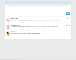
Comment panel
</div>
<div class="panel-body">
<textarea class="form-control" placeholder="write a comment..." rows="3"></textarea>
<br>
<button type="button" class="btn btn-info pull-right">Post</button>
<div class="clearfix"></div>
<hr>
<ul class="media-list">
<li class="media">
<a href="#" class="pull-left">
<img src="https://bootdey.com/img/Content/user_1.jpg" alt="" class="img-circle">
</a>
<div class="media-body">
<span class="text-muted pull-right">
<small class="text-muted">30 min ago</small>
</span>
<strong class="text-success">@MartinoMont</strong>
<p>
Lorem ipsum dolor sit amet, consectetur adipiscing elit.
Lorem ipsum dolor sit amet, <a href="#">#consecteturadipiscing </a>.
</p>
</div>
</li>
<li class="media">
<a href="#" class="pull-left">
<img src="https://bootdey.com/img/Content/user_2.jpg" alt="" class="img-circle">
</a>
<div class="media-body">
<span class="text-muted pull-right">
<small class="text-muted">30 min ago</small>
</span>
<strong class="text-success">@LaurenceCorreil</strong>
<p>
Lorem ipsum dolor sit amet, consectetur adipiscing elit.
Lorem ipsum dolor <a href="#">#ipsumdolor </a>adipiscing elit.
</p>
</div>
</li>
<li class="media">
<a href="#" class="pull-left">
<img src="https://bootdey.com/img/Content/user_3.jpg" alt="" class="img-circle">
</a>
<div class="media-body">
<span class="text-muted pull-right">
<small class="text-muted">30 min ago</small>
</span>
<strong class="text-success">@JohnNida</strong>
<p>
Lorem ipsum dolor <a href="#">#sitamet</a> sit amet, consectetur adipiscing elit.
</p>
</div>
</li>
</ul>
</div>
</div>
</div>
</div>
</div>
</div>CSS code
Scoped CSS that styles the component. Paste it after Bootstrap 3.3.4 to keep the design, spacing, and responsiveness consistent.
Downloadbody{margin-top:20px;}
.comment-wrapper .panel-body {
max-height:650px;
overflow:auto;
}
.comment-wrapper .media-list .media img {
width:64px;
height:64px;
border:2px solid #e5e7e8;
}
.comment-wrapper .media-list .media {
border-bottom:1px dashed #efefef;
margin-bottom:25px;
}FAQ
How do I use this snippet?
Include Bootstrap 3.3.4, paste the HTML, add the CSS block, and include the JS (if any) to mirror the live preview.
Can I use it in commercial projects?
Yes. It’s free for personal and commercial work; check the snippets license for details.
Is it responsive?
Yes. It inherits the responsive grid and components from Bootstrap 3.3.4.
About this bootstrap example/template
This free Bootstrap 3.3.4 snippet, Simple Comment panel, was published on Jun 20th 2015, 07:33 by Bootdey Admin.
Optimized for copy‑paste: clean HTML, scoped CSS, and minimal JS so you can ship production‑ready UI faster and keep designs consistent.
Mobile‑first and responsive by default. Tested across modern browsers to reduce polish time on your project.
Already trusted in 50.5K+ views. Reuse this snippet to speed up landing pages, dashboards, or onboarding flows.
Bootstrap 3.3.4
<link rel='stylesheet' href='https://netdna.bootstrapcdn.com/bootstrap/3.3.4/css/bootstrap.min.css'>
<script src='https://netdna.bootstrapcdn.com/bootstrap/3.3.4/js/bootstrap.min.js'></script>
This code example is based on bootstrap 3.3.4 and the grid system of this framework
Responsive
Based on bootstrap framework makes all the layouts perfectly responsive for all devices
Crossbrowser compatibility
Tested on all major browsers, it works smoothly on all of them
semantic html 5
Built on html / css3 the code quality is really amazing
Simple Integration
This code example can be simply integrated on existing sites and new ones too, all you need to do is copy the code and start working
