HTML code
Clean, semantic HTML that powers this Bootstrap 4.1.1 snippet. Copy and paste it into your page (with Bootstrap loaded) to reproduce the exact layout shown in the preview.
Download<main role="main" class="container bootdey.com">
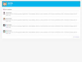
<div class="d-flex align-items-center p-3 my-3 text-white-50 bg-blue rounded box-shadow">
<img class="mr-3" src="https://bootdey.com/img/Content/avatar/avatar1.png" alt="" width="48" height="48">
<div class="lh-100">
<h6 class="mb-0 text-white lh-100">John Doe</h6>
<small>Messages</small>
</div>
</div>
<div class="my-3 p-3 bg-white rounded box-shadow">
<h6 class="border-bottom border-gray pb-2 mb-0">Recent updates</h6>
<div class="media text-muted pt-3">
<img src="https://bootdey.com/img/Content/avatar/avatar7.png" alt="" class="mr-2 rounded" width="32" height="32">
<p class="media-body pb-3 mb-0 small lh-125 border-bottom border-gray">
<strong class="d-block text-gray-dark">@username</strong>
Donec id elit non mi porta gravida at eget metus. Fusce dapibus, tellus ac cursus commodo, tortor mauris condimentum nibh, ut fermentum massa justo sit amet risus.
</p>
</div>
<div class="media text-muted pt-3">
<img src="https://bootdey.com/img/Content/avatar/avatar6.png" alt="" class="mr-2 rounded" width="32" height="32">
<p class="media-body pb-3 mb-0 small lh-125 border-bottom border-gray">
<strong class="d-block text-gray-dark">@username</strong>
Donec id elit non mi porta gravida at eget metus. Fusce dapibus, tellus ac cursus commodo, tortor mauris condimentum nibh, ut fermentum massa justo sit amet risus.
</p>
</div>
<div class="media text-muted pt-3">
<img src="https://bootdey.com/img/Content/avatar/avatar5.png" alt="" class="mr-2 rounded" width="32" height="32">
<p class="media-body pb-3 mb-0 small lh-125 border-bottom border-gray">
<strong class="d-block text-gray-dark">@username</strong>
Donec id elit non mi porta gravida at eget metus. Fusce dapibus, tellus ac cursus commodo, tortor mauris condimentum nibh, ut fermentum massa justo sit amet risus.
</p>
</div>
<div class="media text-muted pt-3">
<img src="https://bootdey.com/img/Content/avatar/avatar4.png" alt="" class="mr-2 rounded" width="32" height="32">
<p class="media-body pb-3 mb-0 small lh-125 border-bottom border-gray">
<strong class="d-block text-gray-dark">@username</strong>
Donec id elit non mi porta gravida at eget metus. Fusce dapibus, tellus ac cursus commodo, tortor mauris condimentum nibh, ut fermentum massa justo sit amet risus.
</p>
</div>
<small class="d-block text-right mt-3">
<a href="#">All messages</a>
</small>
</div>
</main>CSS code
Scoped CSS that styles the component. Paste it after Bootstrap 4.1.1 to keep the design, spacing, and responsiveness consistent.
Downloadbody{background:#f5f5f5}
.text-white-50 { color: rgba(255, 255, 255, .5); }
.bg-blue { background-color:#00b5ec; }
.border-bottom { border-bottom: 1px solid #e5e5e5; }
.box-shadow { box-shadow: 0 .25rem .75rem rgba(0, 0, 0, .05); }FAQ
How do I use this snippet?
Include Bootstrap 4.1.1, paste the HTML, add the CSS block, and include the JS (if any) to mirror the live preview.
Can I use it in commercial projects?
Yes. It’s free for personal and commercial work; check the snippets license for details.
Is it responsive?
Yes. It inherits the responsive grid and components from Bootstrap 4.1.1.
About this bootstrap example/template
This free Bootstrap 4.1.1 snippet, Messages Board, was published on Mar 14th 2017, 07:21 by Bootdey Admin.
Optimized for copy‑paste: clean HTML, scoped CSS, and minimal JS so you can ship production‑ready UI faster and keep designs consistent.
Mobile‑first and responsive by default. Tested across modern browsers to reduce polish time on your project.
Already trusted in 22.4K+ views. Reuse this snippet to speed up landing pages, dashboards, or onboarding flows.
Bootstrap 4.1.1
<link rel='stylesheet' href='https://cdn.jsdelivr.net/npm/[email protected]/dist/css/bootstrap.min.css'>
<script src='https://cdn.jsdelivr.net/npm/[email protected]/dist/js/bootstrap.bundle.min.js'></script>
This code example is based on bootstrap 4.1.1 and the grid system of this framework
Responsive
Based on bootstrap framework makes all the layouts perfectly responsive for all devices
Crossbrowser compatibility
Tested on all major browsers, it works smoothly on all of them
semantic html 5
Built on html / css3 the code quality is really amazing
Simple Integration
This code example can be simply integrated on existing sites and new ones too, all you need to do is copy the code and start working
