HTML code
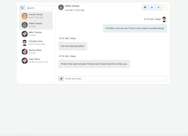
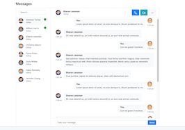
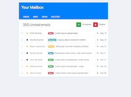
This is the html code used to create this bootstrap snippet, You can copy and paste the following html code inside a page with bootstrap 3.3.4 included, to get the result that you can see in the preview selection
Download<link href="https://maxcdn.bootstrapcdn.com/font-awesome/4.3.0/css/font-awesome.min.css" rel="stylesheet">
<div class="container bootstrap snippets bootdey">
<div class="row">
<div class="col-md-3">
<div class="panel rounded shadow">
<div class="panel-body">
<div class="inner-all">
<ul class="list-unstyled">
<li class="text-center">
<img class="img-circle img-responsive img-bordered-primary" src="https://bootdey.com/img/Content/avatar/avatar1.png" alt="Marint month">
</li>
<li class="text-center">
<h4 class="text-capitalize">Marint month</h4>
<p class="text-muted text-capitalize">web designer</p>
</li>
<li>
<a href="" class="btn btn-success text-center btn-block">PRO Account</a>
</li>
<li><br></li>
<li>
<div class="btn-group-vertical btn-block">
<a href="" class="btn btn-default"><i class="fa fa-cog pull-right"></i>Edit Account</a>
<a href="" class="btn btn-default"><i class="fa fa-sign-out pull-right"></i>Logout</a>
</div>
</li>
</ul>
</div>
</div>
</div>
</div>
<div class="col-md-9">
<div class="panel cover rounded shadow no-overflow">
<div class="panel-body">
<div class="inner-cover">
<img src="https://www.bootdey.com/image/600x150/FF69B4/000000" class="img-responsive full-width" alt="cover">
</div>
</div>
</div>
<div class="panel cover rounded shadow no-overflow" style="height:200px;">
<div class="panel-body">
content!!
</div>
</div>
</div>
</div>
</div>CSS code
This is the css code used to create this bootstrap snippet, You can copy and paste the following css code inside a page with bootstrap 3.3.4 included, to get the result that you can see in the preview selection
Downloadbody{
background:#eee;
margin-top:20px;
}
.shadow {
-webkit-box-shadow: 0px 1px 1px rgba(0, 0, 0, 0.05) !important;
-moz-box-shadow: 0px 1px 1px rgba(0, 0, 0, 0.05) !important;
box-shadow: 0px 1px 1px rgba(0, 0, 0, 0.05) !important;
}
.rounded {
-webkit-border-radius: 3px !important;
-moz-border-radius: 3px !important;
border-radius: 3px !important;
}
.panel {
border: none;
position: relative;
-webkit-border-radius: 0px;
-moz-border-radius: 0px;
border-radius: 0px;
-webkit-box-shadow: none;
-moz-box-shadow: none;
box-shadow: none;
}
.btn{
border-radius:0px;
}
.profile-cover {
width: 100%;
}
.profile-cover .cover {
position: relative;
border: 10px solid #FFF;
background:#fff;
}
.profile-cover .cover .inner-cover {
overflow: hidden;
height: auto;
}
.profile-cover .cover .inner-cover .cover-menu-mobile {
position: absolute;
top: 10px;
right: 10px;
}
.full-width {
top: 0;
left: 0;
/* Preserve aspet ratio */
min-width: 100%;
min-height: 100%;
}
About this bootstrap example/template
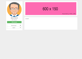
This example/template, profile with left cover, was published on Jul 2nd 2015, 00:36 by Bootdey Admin and it is free.
We hope you will enjoy this awesome snippet and stay tuned for the latest updates, bootdey snippets are already used in thousands of blogs, websites and projects. We believe it will save your precious time and gives trendy look to your next web project.
We always try to offer the best beautiful and responsive source of Bootstrap code examples and components.
This code example currectly have 8.6K views, Using this bootstrap snippet you have the following benefits:
Bootstrap 3.3.4
<link rel='stylesheet' href='https://netdna.bootstrapcdn.com/bootstrap/3.3.4/css/bootstrap.min.css'>
<script src='https://netdna.bootstrapcdn.com/bootstrap/3.3.4/js/bootstrap.min.js'></script>
This code example is based on bootstrap 3.3.4 and the grid system of this framework
Responsive
Based on bootstrap framework makes all the layouts perfectly responsive for all devices
Crossbrowser compatibility
Tested on all major browsers, it works smoothly on all of them
semantic html 5
Built on html / css3 the code quality is really amazing
Simple Integration
This code example can be simply integrated on existing sites and new ones too, all you need to do is copy the code and start working
