HTML code
Clean, semantic HTML that powers this Bootstrap 4.5.0 snippet. Copy and paste it into your page (with Bootstrap loaded) to reproduce the exact layout shown in the preview.
Download<link rel="stylesheet" href="https://cdn.jsdelivr.net/gh/lykmapipo/[email protected]/css/themify-icons.css">
<section data-stellar-background-ratio="0.3" class="counter_feature">
<div class="container">
<div class="row text-center">
<div class="col-lg-3 col-sm-6 col-xs-12 no-padding wow fadeInUp" data-wow-duration="1s" data-wow-delay="0.1s" data-wow-offset="0">
<div class="single-project">
<span class="ti-user"></span>
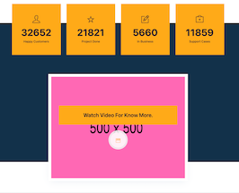
<h2 class="counter-num">32652</h2>
<h4>Happy Customers</h4>
</div>
</div>
<div class="col-lg-3 col-sm-6 col-xs-12 no-padding wow fadeInUp" data-wow-duration="1s" data-wow-delay="0.2s" data-wow-offset="0">
<div class="single-project">
<span class="ti-star"></span>
<h2 class="counter-num">21821</h2>
<h4>Project Done</h4>
</div>
</div><!-- END COL -->
<div class="col-lg-3 col-sm-6 col-xs-12 no-padding wow fadeInUp" data-wow-duration="1s" data-wow-delay="0.3s" data-wow-offset="0">
<div class="single-project">
<span class="ti-pencil-alt"></span>
<h2 class="counter-num">5660</h2>
<h4>In Business</h4>
</div>
</div><!-- END COL -->
<div class="col-lg-3 col-sm-6 col-xs-12 no-padding wow fadeInUp" data-wow-duration="1s" data-wow-delay="0.4s" data-wow-offset="0">
<div class="single-project">
<span class="ti-support"></span>
<h2 class="counter-num">11859</h2>
<h4>Support Cases</h4>
</div>
</div><!-- END COL -->
</div><!--- END ROW -->
<div class="row text-center">
<div class="col-lg-8 offset-lg-2 col-sm-12 col-xs-12 wow fadeInUp" data-wow-duration="1s" data-wow-delay="0.3s" data-wow-offset="0">
<div class="video_btn" style="background-image: url(https://www.bootdey.com/image/500x500/FF69B4/000000); background-size:cover; background-position: center center;">
<h3>Watch video for know more.</h3>
<a class="video-play" href="#"><i class="ti-video-clapper"></i></a>
</div>
</div>
</div><!--- END ROW -->
</div><!--- END CONTAINER -->
</section>CSS code
Scoped CSS that styles the component. Paste it after Bootstrap 4.5.0 to keep the design, spacing, and responsiveness consistent.
Downloadbody{margin-top:20px;}
.counter_feature {
background-image: url("https://www.bootdey.com/image/280x280/48D1CC/000000");
background-size: 100%;
background-repeat: no-repeat;
background-position: top center;
position: relative;
margin-top:120px;
}
.counter_feature:before {
background:#020928;
opacity:0.8;
-ms-filter: "progid:DXImageTransform.Microsoft.Alpha(Opacity=85)";
bottom: 0;
content: "";
height: 100%;
left: 0;
position: absolute;
right: 0;
top: 0;
width: 100%;
}
.single-project {
padding: 60px 40px;
background: #ffaa17;
margin-top: -100px;
border-right: 1px solid #e89505;
}
@media only screen and (max-width:768px){
.single-project {margin-top: -60px;}
}
.single-project span {
font-size: 40px;
margin-bottom: 20px;
display: inline-block;
}
.single-project h2 {
font-weight: 700;
font-size: 50px;
}
.single-project h4 {
margin-bottom: 0;
font-size:16px;
}
.mfp-iframe-holder .mfp-content {
line-height: 0;
margin-top: 55px;
max-width: 900px;
width: 100%;
}
.video_btn {
padding:150px 0;
position: relative;
border:15px solid #fff;
margin-top: 100px;
margin-bottom:-100px;
box-shadow:0 10px 40px -10px rgba(0,64,128,.09);
}
.video_btn h3 {
background: #ffaa17;
padding: 30px;
margin: 0 40px;
line-height: 40px;
margin-bottom: 30px;
text-transform: capitalize;
font-weight: 600;
}
.video_btn a {
background: rgba(255, 255, 255, 0.9) none repeat scroll 0 0;
border: 10px solid rgba(0, 0, 0, 0.05);
border-radius: 100px;
color: #ffaa17;
display: block;
font-size: 24px;
height: 100px;
line-height: 90px;
margin-bottom: auto;
margin-left: auto;
margin-right: auto;
text-align: center;
width: 100px;
}FAQ
How do I use this snippet?
Include Bootstrap 4.5.0, paste the HTML, add the CSS block, and include the JS (if any) to mirror the live preview.
Can I use it in commercial projects?
Yes. It’s free for personal and commercial work; check the snippets license for details.
Is it responsive?
Yes. It inherits the responsive grid and components from Bootstrap 4.5.0.
About this bootstrap example/template
This free Bootstrap 4.5.0 snippet, counter feature, was published on Jun 8th 2021, 10:19 by Bootdey Admin.
Optimized for copy‑paste: clean HTML, scoped CSS, and minimal JS so you can ship production‑ready UI faster and keep designs consistent.
Mobile‑first and responsive by default. Tested across modern browsers to reduce polish time on your project.
Already trusted in 5.0K+ views. Reuse this snippet to speed up landing pages, dashboards, or onboarding flows.
Bootstrap 4.5.0
<link rel='stylesheet' href='https://cdn.jsdelivr.net/npm/[email protected]/dist/css/bootstrap.min.css'>
<script src='https://cdn.jsdelivr.net/npm/[email protected]/dist/js/bootstrap.bundle.min.js'></script>
This code example is based on bootstrap 4.5.0 and the grid system of this framework
Responsive
Based on bootstrap framework makes all the layouts perfectly responsive for all devices
Crossbrowser compatibility
Tested on all major browsers, it works smoothly on all of them
semantic html 5
Built on html / css3 the code quality is really amazing
Simple Integration
This code example can be simply integrated on existing sites and new ones too, all you need to do is copy the code and start working
