HTML code
Clean, semantic HTML that powers this Bootstrap 5.2.0 snippet. Copy and paste it into your page (with Bootstrap loaded) to reproduce the exact layout shown in the preview.
Download<div class="container">
<div class="row">
<div class="col-xl-4 col-md-4 mb-3 mb-lg-5">
<!--Card-->
<div class="card overflow-hidden text-center">
<img src="https://www.bootdey.com/image/280x120/6495ED/000000" class="card-img-top img-fluid" alt="">
<!--Card body-->
<div class="card-body p-0">
<!--avatar-->
<a href="#!.html" class="avatar xl rounded-circle bg-gray bg-opacity-10 p-1 position-relative mt-n5 d-block mx-auto">
<img src="https://bootdey.com/img/Content/avatar/avatar1.png" class="avatar-img img-fluid rounded-circle" alt="">
</a>
<h5 class="mb-0 pt-3">
<a href="#!.html" class="text-reset">Noah Pierre</a>
</h5>
<span class="text-muted small d-block mb-4">Full stack developer</span>
<div class="row mx-0 border-top border-bottom">
<div class="col-6 text-center border-end py-3">
<h5 class="mb-0">2345</h5>
<small class="text-muted">Followers</small>
</div>
<div class="col-6 text-center py-3">
<h5 class="mb-0">54</h5>
<small class="text-muted">Following</small>
</div>
</div>
<ul class="list-group list-group-flush">
<li class="list-group-item px-3 d-flex align-items-center justify-content-between">
<span class="text-muted small">Join</span>
<strong>April 2014</strong>
</li>
<li class="list-group-item px-3 d-flex align-items-center justify-content-between">
<span class="text-muted small">Location</span>
<strong>Barcelona, Spain</strong>
</li>
<li class="list-group-item px-3 d-flex align-items-center justify-content-between">
<span class="text-muted small d-flex align-items-center">
<span class="align-middle lh-1 me-1 size-5 border border-4 border-success rounded-circle d-inline-block"></span>
Online
</span>
<div class="text-end">
<a href="#!.html" class="btn btn-sm btn-primary">Follow</a>
</div>
</li>
</ul>
</div>
</div>
</div>
<div class="col-xl-4 col-md-4 mb-3 mb-lg-5">
<!--Card-->
<div class="card overflow-hidden text-center">
<img src="https://www.bootdey.com/image/280x120/FFB6C1/000000" class="card-img-top img-fluid" alt="">
<!--Card body-->
<div class="card-body p-0">
<!--avatar-->
<a href="#!.html" class="avatar xl rounded-circle bg-gray bg-opacity-10 p-1 position-relative mt-n5 d-block mx-auto">
<img src="https://bootdey.com/img/Content/avatar/avatar2.png" class="avatar-img img-fluid rounded-circle" alt="">
</a>
<h5 class="mb-0 pt-3">
<a href="#!.html" class="text-reset">Noah Pierre</a>
</h5>
<span class="text-muted small d-block mb-4">Full stack developer</span>
<div class="row mx-0 border-top border-bottom">
<div class="col-6 text-center border-end py-3">
<h5 class="mb-0">2345</h5>
<small class="text-muted">Followers</small>
</div>
<div class="col-6 text-center py-3">
<h5 class="mb-0">54</h5>
<small class="text-muted">Following</small>
</div>
</div>
<ul class="list-group list-group-flush">
<li class="list-group-item px-3 d-flex align-items-center justify-content-between">
<span class="text-muted small">Join</span>
<strong>April 2014</strong>
</li>
<li class="list-group-item px-3 d-flex align-items-center justify-content-between">
<span class="text-muted small">Location</span>
<strong>Barcelona, Spain</strong>
</li>
<li class="list-group-item px-3 d-flex align-items-center justify-content-between">
<span class="text-muted small d-flex align-items-center">
<span class="align-middle lh-1 me-1 size-5 border border-4 border-success rounded-circle d-inline-block"></span>
Online
</span>
<div class="text-end">
<a href="#!.html" class="btn btn-sm btn-primary">Follow</a>
</div>
</li>
</ul>
</div>
</div>
</div>
</div>
</div>CSS code
Scoped CSS that styles the component. Paste it after Bootstrap 5.2.0 to keep the design, spacing, and responsiveness consistent.
Downloadbody{margin-top:20px;
background:#eee;
}
.avatar.xl {
width: 5rem;
height: 5rem;
font-size: 1.09375rem;
}
.avatar img {
max-width: 100%;
display: block;
}
.rounded-circle {
border-radius: 50%!important;
}
.rounded-circle {
border-radius: 50%!important;
}
.bg-opacity-10 {
--bs-bg-opacity: 0.1;
}
.bg-gray {
--bs-bg-opacity: 1;
background-color: rgba(var(--bs-gray-rgb),var(--bs-bg-opacity))!important;
}
.p-1 {
padding: 0.25rem!important;
}
.mt-n5 {
margin-top: -1.5rem!important;
}
.mx-auto {
margin-right: auto!important;
margin-left: auto!important;
}
.position-relative {
position: relative!important;
}
.d-block {
display: block!important;
}
a {
color: var(--bs-link-color);
text-decoration: none;
}FAQ
How do I use this snippet?
Include Bootstrap 5.2.0, paste the HTML, add the CSS block, and include the JS (if any) to mirror the live preview.
Can I use it in commercial projects?
Yes. It’s free for personal and commercial work; check the snippets license for details.
Is it responsive?
Yes. It inherits the responsive grid and components from Bootstrap 5.2.0.
About this bootstrap example/template
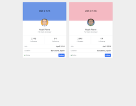
This free Bootstrap 5.2.0 snippet, card with join and location, was published on Dec 2nd 2022, 12:04 by Bootdey Admin.
Optimized for copy‑paste: clean HTML, scoped CSS, and minimal JS so you can ship production‑ready UI faster and keep designs consistent.
Mobile‑first and responsive by default. Tested across modern browsers to reduce polish time on your project.
Already trusted in 7.7K+ views. Reuse this snippet to speed up landing pages, dashboards, or onboarding flows.
Bootstrap 5.2.0
<link rel='stylesheet' href='https://cdn.jsdelivr.net/npm/[email protected]/dist/css/bootstrap.min.css'>
<script src='https://cdn.jsdelivr.net/npm/[email protected]/dist/js/bootstrap.bundle.min.js'></script>
This code example is based on bootstrap 5.2.0 and the grid system of this framework
Responsive
Based on bootstrap framework makes all the layouts perfectly responsive for all devices
Crossbrowser compatibility
Tested on all major browsers, it works smoothly on all of them
semantic html 5
Built on html / css3 the code quality is really amazing
Simple Integration
This code example can be simply integrated on existing sites and new ones too, all you need to do is copy the code and start working
