HTML code
Clean, semantic HTML that powers this Bootstrap 5.0.1 snippet. Copy and paste it into your page (with Bootstrap loaded) to reproduce the exact layout shown in the preview.
Download<link rel="stylesheet" href="https://cdnjs.cloudflare.com/ajax/libs/font-awesome/5.13.1/css/all.min.css" integrity="sha256-2XFplPlrFClt0bIdPgpz8H7ojnk10H69xRqd9+uTShA=" crossorigin="anonymous" />
<link rel="stylesheet" href="https://cdn.jsdelivr.net/npm/[email protected]/css/themify-icons.css">
<div class="container">
<div class="row justify-content-center">
<div class="col-md-7 col-lg-4 mb-5 mb-lg-0 wow fadeIn">
<div class="card border-0 shadow">
<img src="https://www.bootdey.com/img/Content/avatar/avatar6.png" alt="...">
<div class="card-body p-1-9 p-xl-5">
<div class="mb-4">
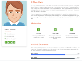
<h3 class="h4 mb-0">Dakota Johnston</h3>
<span class="text-primary">CEO & Founder</span>
</div>
<ul class="list-unstyled mb-4">
<li class="mb-3"><a href="#!"><i class="far fa-envelope display-25 me-3 text-secondary"></i>[email protected]</a></li>
<li class="mb-3"><a href="#!"><i class="fas fa-mobile-alt display-25 me-3 text-secondary"></i>+012 (345) 6789</a></li>
<li><a href="#!"><i class="fas fa-map-marker-alt display-25 me-3 text-secondary"></i>205 Main Street, USA</a></li>
</ul>
<ul class="social-icon-style2 ps-0">
<li><a href="#!" class="rounded-3"><i class="fab fa-facebook-f"></i></a></li>
<li><a href="#!" class="rounded-3"><i class="fab fa-twitter"></i></a></li>
<li><a href="#!" class="rounded-3"><i class="fab fa-youtube"></i></a></li>
<li><a href="#!" class="rounded-3"><i class="fab fa-linkedin-in"></i></a></li>
</ul>
</div>
</div>
</div>
<div class="col-lg-8">
<div class="ps-lg-1-6 ps-xl-5">
<div class="mb-5 wow fadeIn">
<div class="text-start mb-1-6 wow fadeIn">
<h2 class="h1 mb-0 text-primary">#About Me</h2>
</div>
<p>It is a long established fact that a reader will be distracted by the readable content of a page when looking at its layout. The point of using Lorem Ipsum is that it has a more-or-less normal distribution of letters, as opposed to using 'Content here, content here', making it look like readable English. Many desktop publishing packages and web page editors now use Lorem Ipsum as their default model text, and a search for 'lorem ipsum' will uncover many web sites still in their infancy.</p>
<p class="mb-0">There are many variations of passages of Lorem Ipsum available, but the majority have suffered alteration in some form, by injected humour, or randomised words which don't look even slightly believable. If you are going to use a passage of Lorem Ipsum, you need to be sure there isn't anything embarrassing hidden in the middle of text.</p>
</div>
<div class="mb-5 wow fadeIn">
<div class="text-start mb-1-6 wow fadeIn">
<h2 class="mb-0 text-primary">#Education</h2>
</div>
<div class="row mt-n4">
<div class="col-sm-6 col-xl-4 mt-4">
<div class="card text-center border-0 rounded-3">
<div class="card-body">
<i class="ti-bookmark-alt icon-box medium rounded-3 mb-4"></i>
<h3 class="h5 mb-3">Education</h3>
<p class="mb-0">University of defgtion, fecat complete ME of synage</p>
</div>
</div>
</div>
<div class="col-sm-6 col-xl-4 mt-4">
<div class="card text-center border-0 rounded-3">
<div class="card-body">
<i class="ti-pencil-alt icon-box medium rounded-3 mb-4"></i>
<h3 class="h5 mb-3">Career Start</h3>
<p class="mb-0">After complete engineer join HU Signage Ltd as a project manager</p>
</div>
</div>
</div>
<div class="col-sm-6 col-xl-4 mt-4">
<div class="card text-center border-0 rounded-3">
<div class="card-body">
<i class="ti-medall-alt icon-box medium rounded-3 mb-4"></i>
<h3 class="h5 mb-3">Experience</h3>
<p class="mb-0">About 20 years of experience and professional in signage</p>
</div>
</div>
</div>
</div>
</div>
<div class="wow fadeIn">
<div class="text-start mb-1-6 wow fadeIn">
<h2 class="mb-0 text-primary">#Skills & Experience</h2>
</div>
<p class="mb-4">Many desktop publishing packages and web page editors now use Lorem Ipsum as their default model text, and a search for 'lorem ipsum' will uncover many web sites still in their infancy. Various versions have evolved over the years, sometimes by accident, sometimes on purpose.</p>
<div class="progress-style1">
<div class="progress-text">
<div class="row">
<div class="col-6 fw-bold">Wind Turbines</div>
<div class="col-6 text-end">70%</div>
</div>
</div>
<div class="custom-progress progress rounded-3 mb-4">
<div class="animated custom-bar progress-bar slideInLeft" style="width:70%" aria-valuemax="100" aria-valuemin="0" aria-valuenow="10" role="progressbar"></div>
</div>
<div class="progress-text">
<div class="row">
<div class="col-6 fw-bold">Solar Panels</div>
<div class="col-6 text-end">90%</div>
</div>
</div>
<div class="custom-progress progress rounded-3 mb-4">
<div class="animated custom-bar progress-bar bg-secondary slideInLeft" style="width:90%" aria-valuemax="100" aria-valuemin="0" aria-valuenow="70" role="progressbar"></div>
</div>
<div class="progress-text">
<div class="row">
<div class="col-6 fw-bold">Hybrid Energy</div>
<div class="col-6 text-end">80%</div>
</div>
</div>
<div class="custom-progress progress rounded-3">
<div class="animated custom-bar progress-bar bg-dark slideInLeft" style="width:80%" aria-valuemax="100" aria-valuemin="0" aria-valuenow="70" role="progressbar"></div>
</div>
</div>
</div>
</div>
</div>
</div>
</div>CSS code
Scoped CSS that styles the component. Paste it after Bootstrap 5.0.1 to keep the design, spacing, and responsiveness consistent.
Downloadbody{margin-top:20px;}
.icon-box.medium {
font-size: 20px;
width: 50px;
height: 50px;
line-height: 50px;
}
.icon-box {
font-size: 30px;
margin-bottom: 33px;
display: inline-block;
color: #ffffff;
height: 65px;
width: 65px;
line-height: 65px;
background-color: #59b73f;
text-align: center;
border-radius: 0.3rem;
}
.social-icon-style2 li a {
display: inline-block;
font-size: 14px;
text-align: center;
color: #ffffff;
background: #59b73f;
height: 41px;
line-height: 41px;
width: 41px;
}
.rounded-3 {
border-radius: 0.3rem !important;
}
.social-icon-style2 {
margin-bottom: 0;
display: inline-block;
padding-left: 10px;
list-style: none;
}
.social-icon-style2 li {
vertical-align: middle;
display: inline-block;
margin-right: 5px;
}
a, a:active, a:focus {
color: #616161;
text-decoration: none;
transition-timing-function: ease-in-out;
-ms-transition-timing-function: ease-in-out;
-moz-transition-timing-function: ease-in-out;
-webkit-transition-timing-function: ease-in-out;
-o-transition-timing-function: ease-in-out;
transition-duration: .2s;
-ms-transition-duration: .2s;
-moz-transition-duration: .2s;
-webkit-transition-duration: .2s;
-o-transition-duration: .2s;
}
.text-secondary, .text-secondary-hover:hover {
color: #59b73f !important;
}
.display-25 {
font-size: 1.4rem;
}
.text-primary, .text-primary-hover:hover {
color: #ff712a !important;
}
p {
margin: 0 0 20px;
}
.mb-1-6, .my-1-6 {
margin-bottom: 1.6rem;
}FAQ
How do I use this snippet?
Include Bootstrap 5.0.1, paste the HTML, add the CSS block, and include the JS (if any) to mirror the live preview.
Can I use it in commercial projects?
Yes. It’s free for personal and commercial work; check the snippets license for details.
Is it responsive?
Yes. It inherits the responsive grid and components from Bootstrap 5.0.1.
About this bootstrap example/template
This free Bootstrap 5.0.1 snippet, bs5 team member details, was published on Sep 12th 2021, 19:42 by Bootdey Admin.
Optimized for copy‑paste: clean HTML, scoped CSS, and minimal JS so you can ship production‑ready UI faster and keep designs consistent.
Mobile‑first and responsive by default. Tested across modern browsers to reduce polish time on your project.
Already trusted in 24.8K+ views. Reuse this snippet to speed up landing pages, dashboards, or onboarding flows.
Bootstrap 5.0.1
<link rel='stylesheet' href='https://cdn.jsdelivr.net/npm/[email protected]/dist/css/bootstrap.min.css'>
<script src='https://cdn.jsdelivr.net/npm/[email protected]/dist/js/bootstrap.bundle.min.js'></script>
This code example is based on bootstrap 5.0.1 and the grid system of this framework
Responsive
Based on bootstrap framework makes all the layouts perfectly responsive for all devices
Crossbrowser compatibility
Tested on all major browsers, it works smoothly on all of them
semantic html 5
Built on html / css3 the code quality is really amazing
Simple Integration
This code example can be simply integrated on existing sites and new ones too, all you need to do is copy the code and start working
