HTML code
Clean, semantic HTML that powers this Bootstrap 4.1.1 snippet. Copy and paste it into your page (with Bootstrap loaded) to reproduce the exact layout shown in the preview.
Download<div class="ui-bg-cover ui-bg-overlay-container text-white" style="background:#00BFFF;">
<div class="ui-bg-overlay bg-dark opacity-50"></div>
<div class="container py-5">
<div class="media col-md-10 col-lg-8 col-xl-7 p-0 my-4 mx-auto">
<img src="https://bootdey.com/img/Content/avatar/avatar1.png" alt class="d-block ui-w-100 rounded-circle">
<div class="media-body ml-5">
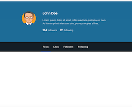
<h4 class="font-weight-bold mb-4">John Doe</h4>
<div class="opacity-75 mb-4">
Lorem ipsum dolor sit amet, nibh suavitate qualisque ut nam. Ad harum primis electram duo, porro principes ei has.
</div>
<a href="#" class="d-inline-block text-white">
<strong>234</strong>
<span class="opacity-75">followers</span>
</a>
<a href="#" class="d-inline-block text-white ml-3">
<strong>111</strong>
<span class="opacity-75">following</span>
</a>
</div>
</div>
</div>
<div class="ui-bg-overlay-container">
<div class="ui-bg-overlay bg-dark opacity-25"></div>
<ul class="nav nav-tabs tabs-alt justify-content-center border-transparent">
<li class="nav-item">
<a class="nav-link text-white py-4 active" href="#">Posts</a>
</li>
<li class="nav-item">
<a class="nav-link text-white py-4" href="#">Likes</a>
</li>
<li class="nav-item">
<a class="nav-link text-white py-4" href="#">Followers</a>
</li>
<li class="nav-item">
<a class="nav-link text-white py-4" href="#">Following</a>
</li>
</ul>
</div>
</div>CSS code
Scoped CSS that styles the component. Paste it after Bootstrap 4.1.1 to keep the design, spacing, and responsiveness consistent.
Download.text-white {
color: #fff !important;
}
.ui-bg-overlay-container, .ui-bg-video-container {
position: relative;
}
.ui-bg-cover {
background-color: transparent;
background-position: center center;
background-size: cover;
}
.ui-bg-overlay-container .ui-bg-overlay {
position: absolute;
top: 0;
right: 0;
bottom: 0;
left: 0;
display: block;
}
.bg-dark {
background-color: rgba(24,28,33,0.9) !important;
}
.opacity-50 {
opacity: .5 !important;
}
.bg-dark {
background-color: rgba(24,28,33,0.9) !important;
}
.ui-bg-overlay-container>*, .ui-bg-video-container>* {
position: relative;
}
@media (min-width: 992px){
.container, .container-fluid {
padding-right: 2rem;
padding-left: 2rem;
}
}
.media, .media>:not(.media-body), .jumbotron, .card {
-ms-flex-negative: 1;
flex-shrink: 1;
}
.d-flex, .d-inline-flex, .media, .media>:not(.media-body), .jumbotron, .card {
-ms-flex-negative: 1;
flex-shrink: 1;
}
.ui-w-100 {
width: 100px !important;
height: auto;
}
.font-weight-bold {
font-weight: 700 !important;
}
.opacity-75 {
opacity: .75 !important;
}
.tabs-alt.nav-tabs .nav-link.active, .tabs-alt.nav-tabs .nav-link.active:hover, .tabs-alt.nav-tabs .nav-link.active:focus, .tabs-alt>.nav-tabs .nav-link.active, .tabs-alt>.nav-tabs .nav-link.active:hover, .tabs-alt>.nav-tabs .nav-link.active:focus {
-webkit-box-shadow: 0 -2px 0 #26B4FF inset;
box-shadow: 0 -2px 0 #26B4FF inset;
}
.nav-tabs:not(.nav-fill):not(.nav-justified) .nav-link, .nav-pills:not(.nav-fill):not(.nav-justified) .nav-link {
margin-right: .125rem;
}
.nav-tabs.tabs-alt .nav-link, .tabs-alt>.nav-tabs .nav-link {
border-width: 0 !important;
border-radius: 0 !important;
background-color: transparent !important;
}
.nav-tabs .nav-link.active {
border-bottom-color: #fff;
}FAQ
How do I use this snippet?
Include Bootstrap 4.1.1, paste the HTML, add the CSS block, and include the JS (if any) to mirror the live preview.
Can I use it in commercial projects?
Yes. It’s free for personal and commercial work; check the snippets license for details.
Is it responsive?
Yes. It inherits the responsive grid and components from Bootstrap 4.1.1.
About this bootstrap example/template
This free Bootstrap 4.1.1 snippet, bs4 user profile cover, was published on Sep 13th 2018, 21:46 by Bootdey Admin.
Optimized for copy‑paste: clean HTML, scoped CSS, and minimal JS so you can ship production‑ready UI faster and keep designs consistent.
Mobile‑first and responsive by default. Tested across modern browsers to reduce polish time on your project.
Already trusted in 8.2K+ views. Reuse this snippet to speed up landing pages, dashboards, or onboarding flows.
Bootstrap 4.1.1
<link rel='stylesheet' href='https://cdn.jsdelivr.net/npm/[email protected]/dist/css/bootstrap.min.css'>
<script src='https://cdn.jsdelivr.net/npm/[email protected]/dist/js/bootstrap.bundle.min.js'></script>
This code example is based on bootstrap 4.1.1 and the grid system of this framework
Responsive
Based on bootstrap framework makes all the layouts perfectly responsive for all devices
Crossbrowser compatibility
Tested on all major browsers, it works smoothly on all of them
semantic html 5
Built on html / css3 the code quality is really amazing
Simple Integration
This code example can be simply integrated on existing sites and new ones too, all you need to do is copy the code and start working
