HTML code
Clean, semantic HTML that powers this Bootstrap 4.1.1 snippet. Copy and paste it into your page (with Bootstrap loaded) to reproduce the exact layout shown in the preview.
Download<div class="accordian">
<ul>
<li>
<div class="image_title">
<a href="#">KungFu Panda</a>
</div>
<a href="#">
<img src="https://www.bootdey.com/image/700x500/6495ED/000000"/>
</a>
</li>
<li>
<div class="image_title">
<a href="#">Toy Story 2</a>
</div>
<a href="#">
<img src="https://www.bootdey.com/image/700x500/5F9EA0/000000"/>
</a>
</li>
<li>
<div class="image_title">
<a href="#">Wall-E</a>
</div>
<a href="#">
<img src="https://www.bootdey.com/image/700x500/FF7F50/000000"/>
</a>
</li>
<li>
<div class="image_title">
<a href="#">Up</a>
</div>
<a href="#">
<img src="https://www.bootdey.com/image/700x500/FF1493/000000"/>
</a>
</li>
<li>
<div class="image_title">
<a href="#">Cars 2</a>
</div>
<a href="#">
<img src="https://www.bootdey.com/image/700x500/FF69B4/000000"/>
</a>
</li>
</ul>
</div>
CSS code
Scoped CSS that styles the component. Paste it after Bootstrap 4.1.1 to keep the design, spacing, and responsiveness consistent.
Download/*Now the styles*/
* {
margin: 0;
padding: 0;
}
body {
background: #ccc;
font-family: arial, verdana, tahoma;
}
/*Time to apply widths for accordian to work
Width of image = 640px
total images = 5
so width of hovered image = 640px
width of un-hovered image = 40px - you can set this to anything
so total container width = 640 + 40*4 = 800px;
default width = 800/5 = 160px;
*/
.accordian {
width: 805px; height: 320px;
overflow: hidden;
/*Time for some styling*/
margin: 100px auto;
box-shadow: 0 0 10px 1px rgba(0, 0, 0, 0.35);
-webkit-box-shadow: 0 0 10px 1px rgba(0, 0, 0, 0.35);
-moz-box-shadow: 0 0 10px 1px rgba(0, 0, 0, 0.35);
}
/*A small hack to prevent flickering on some browsers*/
.accordian ul {
width: 1200px;
/*This will give ample space to the last item to move
instead of falling down/flickering during hovers.*/
}
.accordian li {
position: relative;
display: block;
width: 160px;
float: left;
border-left: 1px solid #888;
box-shadow: 0 0 25px 10px rgba(0, 0, 0, 0.5);
-webkit-box-shadow: 0 0 25px 10px rgba(0, 0, 0, 0.5);
-moz-box-shadow: 0 0 25px 10px rgba(0, 0, 0, 0.5);
/*Transitions to give animation effect*/
transition: all 0.5s;
-webkit-transition: all 0.5s;
-moz-transition: all 0.5s;
/*If you hover on the images now you should be able to
see the basic accordian*/
}
/*Reduce with of un-hovered elements*/
.accordian ul:hover li {width: 40px;}
/*Lets apply hover effects now*/
/*The LI hover style should override the UL hover style*/
.accordian ul li:hover {width: 640px;}
.accordian li img {
display: block;
}
/*Image title styles*/
.image_title {
background: rgba(0, 0, 0, 0.5);
position: absolute;
left: 0; bottom: 0;
width: 640px;
}
.image_title a {
display: block;
color: #fff;
text-decoration: none;
padding: 20px;
font-size: 16px;
}FAQ
How do I use this snippet?
Include Bootstrap 4.1.1, paste the HTML, add the CSS block, and include the JS (if any) to mirror the live preview.
Can I use it in commercial projects?
Yes. It’s free for personal and commercial work; check the snippets license for details.
Is it responsive?
Yes. It inherits the responsive grid and components from Bootstrap 4.1.1.
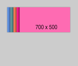
About this bootstrap example/template
This free Bootstrap 4.1.1 snippet, bs4 page slider, was published on Apr 11th 2014, 18:53 by Bootdey Admin.
Optimized for copy‑paste: clean HTML, scoped CSS, and minimal JS so you can ship production‑ready UI faster and keep designs consistent.
Mobile‑first and responsive by default. Tested across modern browsers to reduce polish time on your project.
Already trusted in 7.1K+ views. Reuse this snippet to speed up landing pages, dashboards, or onboarding flows.
Bootstrap 4.1.1
<link rel='stylesheet' href='https://cdn.jsdelivr.net/npm/[email protected]/dist/css/bootstrap.min.css'>
<script src='https://cdn.jsdelivr.net/npm/[email protected]/dist/js/bootstrap.bundle.min.js'></script>
This code example is based on bootstrap 4.1.1 and the grid system of this framework
Responsive
Based on bootstrap framework makes all the layouts perfectly responsive for all devices
Crossbrowser compatibility
Tested on all major browsers, it works smoothly on all of them
semantic html 5
Built on html / css3 the code quality is really amazing
Simple Integration
This code example can be simply integrated on existing sites and new ones too, all you need to do is copy the code and start working
