HTML code
Clean, semantic HTML that powers this Bootstrap 4.3.1 snippet. Copy and paste it into your page (with Bootstrap loaded) to reproduce the exact layout shown in the preview.
Download
<script src="https://cdn.jsdelivr.net/particles.js/2.0.0/particles.min.js"></script>
<section class="section home-5-bg" id="home">
<div id="particles-js"></div>
<div class="bg-overlay"></div>
<div class="home-center">
<div class="home-desc-center">
<div class="container">
<div class="justify-content-center row">
<div class="col-lg-7">
<div class="mt-40 text-center home-5-content">
<div class="home-icon mb-4"><i class="mdi mdi-pinwheel mdi-spin text-white h1"></i></div>
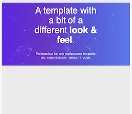
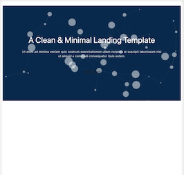
<h1 class="text-white font-weight-normal home-5-title mb-0">A Clean & Minimal Landing Template</h1>
<p class="text-white-70 mt-4 f-15 mb-0">Ut enim ad minima veniam quis nostrum exercitationem ullam corporis at suscipit laboriosam nisi ut aliquid a commodi consequatur Quis autem.</p>
<div class="mt-5">
<input class="btn btn-default" type="button" value="Get started">
</div>
</div>
</div>
</div>
</div>
</div>
</div>
</section>CSS code
Scoped CSS that styles the component. Paste it after Bootstrap 4.3.1 to keep the design, spacing, and responsiveness consistent.
Download
body{
    margin-top:20px;
    backgroundColor:#eee;
}
.home-5-bg {
    background: #1E90FF;
    position: relative;
    background-size: cover;
    height: 50vh;
    background-position: center center;
}

.section {
    position: relative;
}

.home-5-content {
  z-index: 1;
  position: relative;
}

.bg-overlay {
    background-color: #000;
    opacity: 0.7;
    position: absolute;
    top: 0;
    left: 0;
    height: 100%;
    width: 100%;
}

.home-center {
    display: table;
    width: 100%;
    height: 100%;
}

.home-desc-center {
    display: table-cell;
    vertical-align: middle;
}

.home-5-content {
    z-index: 1;
    position: relative;
}

.text-white-70 {
    color: rgba(255, 255, 255, 0.8);
}

.f-15 {
    font-size: 15px;
}

.home-5-bg #particles-js {
    z-index: 1!important;
position: absolute;
    width: 100%;
    height: 100%;
}
Javascript/Jquery code
Lightweight JS to power any interactions this snippet needs. Drop it under your scripts (after Bootstrap 4.3.1) to mirror the live demo.
Download
particlesJS("particles-js", {
  "particles": {
    "number": {
      "value": 80,
      "density": {
        "enable": true,
        "value_area": 800
      }
    },
    "color": {
      "value": "#ffffff"
    },
    "shape": {
      "type": "circle",
      "stroke": {
        "width": 0,
        "color": "#000000"
      },
      "polygon": {
        "nb_sides": 5
      },
      "image": {
        "src": "img/github.svg",
        "width": 100,
        "height": 100
      }
    },
    "opacity": {
      "value": 0.5,
      "random": false,
      "anim": {
        "enable": false,
        "speed": 1,
        "opacity_min": 0.1,
        "sync": false
      }
    },
    "size": {
      "value": 20,
      "random": true,
      "anim": {
        "enable": false,
        "speed": 40,
        "size_min": 0.1,
        "sync": false
      }
    },
    "line_linked": {
      "enable": true,
      "distance": 150,
      "color": "#ffffff",
      "opacity": 0.22,
      "width": 1
    },
    "move": {
      "enable": true,
      "speed": 6,
      "direction": "none",
      "random": false,
      "straight": false,
      "out_mode": "out",
      "attract": {
        "enable": false,
        "rotateX": 600,
        "rotateY": 1200
      }
    }
  },
  "interactivity": {
    "detect_on": "canvas",
    "events": {
      "onhover": {
        "enable": true,
        "mode": "repulse"
      },
      "onclick": {
        "enable": true,
        "mode": "push"
      },
      "resize": true
    },
    "modes": {
      "grab": {
        "distance": 400,
        "line_linked": {
          "opacity": 1
        }
      },
      "bubble": {
        "distance": 400,
        "size": 40,
        "duration": 2,
        "opacity": 8,
        "speed": 3
      },
      "repulse": {
        "distance": 200
      },
      "push": {
        "particles_nb": 4
      },
      "remove": {
        "particles_nb": 2
      }
    }
  },
  "retina_detect": true,
  "config_demo": {
    "hide_card": false,
    "background_color": "#b61924",
    "background_image": "",
    "background_position": "50% 50%",
    "background_repeat": "no-repeat",
    "background_size": "cover"
  }
}); FAQ
How do I use this snippet?
Include Bootstrap 4.3.1, paste the HTML, add the CSS block, and include the JS (if any) to mirror the live preview.
Can I use it in commercial projects?
Yes. It’s free for personal and commercial work; check the snippets license for details.
Is it responsive?
Yes. It inherits the responsive grid and components from Bootstrap 4.3.1.
About this bootstrap example/template
This free Bootstrap 4.3.1 snippet, bs4 header with particles js, was published on May 20th 2019, 11:49 by Bootdey Admin.
Optimized for copy‑paste: clean HTML, scoped CSS, and minimal JS so you can ship production‑ready UI faster and keep designs consistent.
Mobile‑first and responsive by default. Tested across modern browsers to reduce polish time on your project.
Already trusted in 16.9K+ views. Reuse this snippet to speed up landing pages, dashboards, or onboarding flows.
Bootstrap 4.3.1
<link rel='stylesheet' href='https://cdn.jsdelivr.net/npm/[email protected]/dist/css/bootstrap.min.css'>
<script src='https://cdn.jsdelivr.net/npm/[email protected]/dist/js/bootstrap.bundle.min.js'></script>
This code example is based on bootstrap 4.3.1 and the grid system of this framework
Responsive
Based on bootstrap framework makes all the layouts perfectly responsive for all devices
Crossbrowser compatibility
Tested on all major browsers, it works smoothly on all of them
Jquery plugins
Great built-in plugins with jquery framework, you can easy to change all declarations
semantic html 5
Built on html / css3 the code quality is really amazing
Simple Integration
This code example can be simply integrated on existing sites and new ones too, all you need to do is copy the code and start working
