HTML code
This is the html code used to create this bootstrap snippet, You can copy and paste the following html code inside a page with bootstrap 4.5.0 included, to get the result that you can see in the preview selection
Download<section id="pricing" class="pricing-content section-padding">
<div class="container">
<div class="section-title text-center">
<h1>Pricing Plan</h1>
<p>It is a long established fact that a reader will be distracted by the readable content of a page when looking at its layout.</p>
</div>
<div class="row text-center">
<div class="col-lg-4 col-sm-4 col-xs-12 wow fadeInUp" data-wow-duration="1s" data-wow-delay="0.1s" data-wow-offset="0">
<div class="single-pricing">
<div class="price-head">
<h2>Starter</h2>
<span></span>
<span></span>
<span></span>
<span></span>
<span></span>
<span></span>
</div>
<h1 class="price">$29</h1>
<h5>Monthly</h5>
<ul>
<li>5 website</li>
<li>50GB Disk Space</li>
<li>50 Email Accounts</li>
</ul>
<a href="#">Get start</a>
</div>
</div><!--- END COL -->
<div class="col-lg-4 col-sm-4 col-xs-12 wow fadeInUp" data-wow-duration="1s" data-wow-delay="0.2s" data-wow-offset="0">
<div class="single-pricing">
<div class="price-head">
<h2>popular</h2>
<span></span>
<span></span>
<span></span>
<span></span>
<span></span>
<span></span>
</div>
<h1 class="price">$49</h1>
<h5>Monthly</h5>
<ul>
<li>10 website</li>
<li>50GB Disk Space</li>
<li>50 Email Accounts</li>
<li>50GB Monthly Bandwidth</li>
<li>10 Subdomains</li>
</ul>
<a href="#">Get start</a>
</div>
</div><!--- END COL -->
<div class="col-lg-4 col-sm-4 col-xs-12 wow fadeInUp" data-wow-duration="1s" data-wow-delay="0.3s" data-wow-offset="0">
<div class="single-pricing single-pricing-white">
<div class="price-head">
<h2>Advance</h2>
<span></span>
<span></span>
<span></span>
<span></span>
<span></span>
<span></span>
</div>
<span class="price-label">Best</span>
<h1 class="price">$69</h1>
<h5>Monthly</h5>
<ul>
<li>15 website</li>
<li>50GB Disk Space</li>
<li>50 Email Accounts</li>
<li>50GB Monthly Bandwidth</li>
<li>10 Subdomains</li>
<li>15 Domains</li>
<li>Unlimited Support</li>
</ul>
<a href="#">Get start</a>
</div>
</div><!--- END COL -->
</div><!--- END ROW -->
</div><!--- END CONTAINER -->
</section>CSS code
This is the css code used to create this bootstrap snippet, You can copy and paste the following css code inside a page with bootstrap 4.5.0 included, to get the result that you can see in the preview selection
Downloadbody{margin-top:20px;}
.pricing-content{}
.single-pricing{
background:#fff;
padding:40px 20px;
border-radius:5px;
position:relative;
z-index:2;
border:1px solid #eee;
box-shadow: 0 10px 40px -10px rgba(0,64,128,.09);
transition:0.3s;
}
@media only screen and (max-width:480px) {
.single-pricing {margin-bottom:30px;}
}
.single-pricing:hover{
box-shadow:0px 60px 60px rgba(0,0,0,0.1);
z-index:100;
transform: translate(0, -10px);
}
.price-label {
color: #fff;
background: #ffaa17;
font-size: 16px;
width: 100px;
margin-bottom: 15px;
display: block;
-webkit-clip-path: polygon(100% 0%, 90% 50%, 100% 100%, 0% 100%, 0 50%, 0% 0%);
clip-path: polygon(100% 0%, 90% 50%, 100% 100%, 0% 100%, 0 50%, 0% 0%);
margin-left: -20px;
position: absolute;
}
.price-head h2 {
font-weight: 600;
margin-bottom: 0px;
text-transform: capitalize;
font-size: 26px;
}
.price-head span {
display: inline-block;
background:#ffaa17;
width: 6px;
height: 6px;
border-radius: 30px;
margin-bottom: 20px;
margin-top: 15px;
}
.price {
font-weight: 500;
font-size: 50px;
margin-bottom: 0px;
}
.single-pricing{}
.single-pricing h5 {
font-size: 14px;
margin-bottom: 0px;
text-transform: uppercase;
}
.single-pricing ul{
list-style: none;
margin-bottom: 20px;
margin-top: 30px;
}
.single-pricing ul li{line-height: 35px;}
.single-pricing a {
background:none;
border: 2px solid #ffaa17;
border-radius: 5000px;
color: #ffaa17;
display: inline-block;
font-size: 16px;
overflow: hidden;
padding:10px 45px;
text-transform: capitalize;
transition: all 0.3s ease 0s;
}
.single-pricing a:hover, .single-pricing a:focus{
background:#ffaa17;
color:#fff;
border: 2px solid #ffaa17;
}
.single-pricing-white{background: #232434}
.single-pricing-white ul li{color:#fff;}
.single-pricing-white h2{color:#fff;}
.single-pricing-white h1{color:#fff;}
.single-pricing-white h5{color:#fff;}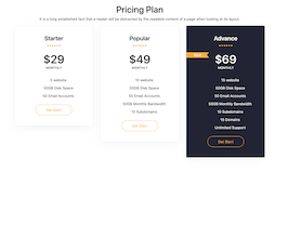
About this bootstrap example/template
This example/template, Pricing Plan With Size, was published on Jun 8th 2021, 10:30 by Bootdey Admin and it is free.
We hope you will enjoy this awesome snippet and stay tuned for the latest updates, bootdey snippets are already used in thousands of blogs, websites and projects. We believe it will save your precious time and gives trendy look to your next web project.
We always try to offer the best beautiful and responsive source of Bootstrap code examples and components.
This code example currectly have 11.7K views, Using this bootstrap snippet you have the following benefits:
Bootstrap 4.5.0
<link rel='stylesheet' href='https://cdn.jsdelivr.net/npm/[email protected]/dist/css/bootstrap.min.css'>
<script src='https://cdn.jsdelivr.net/npm/[email protected]/dist/js/bootstrap.bundle.min.js'></script>
This code example is based on bootstrap 4.5.0 and the grid system of this framework
Responsive
Based on bootstrap framework makes all the layouts perfectly responsive for all devices
Crossbrowser compatibility
Tested on all major browsers, it works smoothly on all of them
semantic html 5
Built on html / css3 the code quality is really amazing
Simple Integration
This code example can be simply integrated on existing sites and new ones too, all you need to do is copy the code and start working
