HTML code
Clean, semantic HTML that powers this Bootstrap 4.5.0 snippet. Copy and paste it into your page (with Bootstrap loaded) to reproduce the exact layout shown in the preview.
Download<section class="section gray-bg" id="blog">
<div class="container">
<div class="row justify-content-center">
<div class="col-lg-7 text-center">
<div class="section-title">
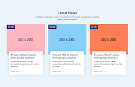
<h2>Latest News</h2>
<p>I design and develop services for customers of all sizes, specializing in creating stylish, modern websites</p>
</div>
</div>
</div>
<div class="row">
<div class="col-lg-4">
<div class="blog-grid">
<div class="blog-img">
<div class="date">04 FEB</div>
<a href="#">
<img src="https://www.bootdey.com/image/350x280/FFB6C1/000000" title="" alt="">
</a>
</div>
<div class="blog-info">
<h5><a href="#">Prevent 75% of visitors from google analytics</a></h5>
<p>Lorem ipsum dolor sit amet, consectetur adipisicing elit, sed do eiusmod.</p>
<div class="btn-bar">
<a href="#" class="px-btn-arrow">
<span>Read More</span>
<i class="arrow"></i>
</a>
</div>
</div>
</div>
</div>
<div class="col-lg-4">
<div class="blog-grid">
<div class="blog-img">
<div class="date">04 FEB</div>
<a href="#">
<img src="https://www.bootdey.com/image/350x280/87CEFA/000000" title="" alt="">
</a>
</div>
<div class="blog-info">
<h5><a href="#">Prevent 75% of visitors from google analytics</a></h5>
<p>Lorem ipsum dolor sit amet, consectetur adipisicing elit, sed do eiusmod.</p>
<div class="btn-bar">
<a href="#" class="px-btn-arrow">
<span>Read More</span>
<i class="arrow"></i>
</a>
</div>
</div>
</div>
</div>
<div class="col-lg-4">
<div class="blog-grid">
<div class="blog-img">
<div class="date">04 FEB</div>
<a href="#">
<img src="https://www.bootdey.com/image/350x280/FF7F50/000000" title="" alt="">
</a>
</div>
<div class="blog-info">
<h5><a href="#">Prevent 75% of visitors from google analytics</a></h5>
<p>Lorem ipsum dolor sit amet, consectetur adipisicing elit, sed do eiusmod.</p>
<div class="btn-bar">
<a href="#" class="px-btn-arrow">
<span>Read More</span>
<i class="arrow"></i>
</a>
</div>
</div>
</div>
</div>
</div>
</div>
</section>CSS code
Scoped CSS that styles the component. Paste it after Bootstrap 4.5.0 to keep the design, spacing, and responsiveness consistent.
Downloadbody{margin-top:20px;}
.section {
padding: 100px 0;
position: relative;
}
.gray-bg {
background-color: #ebf4fa;
}
/* Blog
---------------------*/
.blog-grid {
margin-top: 15px;
margin-bottom: 15px;
}
.blog-grid .blog-img {
position: relative;
border-radius: 5px;
overflow: hidden;
}
.blog-grid .blog-img .date {
position: absolute;
background: #3a3973;
color: #ffffff;
padding: 8px 15px;
left: 0;
top: 10px;
font-size: 14px;
}
.blog-grid .blog-info {
box-shadow: 0 0 30px rgba(31, 45, 61, 0.125);
border-radius: 5px;
background: #ffffff;
padding: 20px;
margin: -30px 20px 0;
position: relative;
}
.blog-grid .blog-info h5 {
font-size: 22px;
font-weight: 500;
margin: 0 0 10px;
}
.blog-grid .blog-info h5 a {
color: #3a3973;
}
.blog-grid .blog-info p {
margin: 0;
}
.blog-grid .blog-info .btn-bar {
margin-top: 20px;
}
.px-btn-arrow {
padding: 0 50px 0 0;
line-height: 20px;
position: relative;
display: inline-block;
color: #fe4f6c;
-moz-transition: ease all 0.3s;
-o-transition: ease all 0.3s;
-webkit-transition: ease all 0.3s;
transition: ease all 0.3s;
}
.px-btn-arrow .arrow {
width: 13px;
height: 2px;
background: currentColor;
display: inline-block;
position: absolute;
top: 0;
bottom: 0;
margin: auto;
right: 25px;
-moz-transition: ease right 0.3s;
-o-transition: ease right 0.3s;
-webkit-transition: ease right 0.3s;
transition: ease right 0.3s;
}
.px-btn-arrow .arrow:after {
width: 8px;
height: 8px;
border-right: 2px solid currentColor;
border-top: 2px solid currentColor;
content: "";
position: absolute;
top: -3px;
right: 0;
display: inline-block;
-moz-transform: rotate(45deg);
-o-transform: rotate(45deg);
-ms-transform: rotate(45deg);
-webkit-transform: rotate(45deg);
transform: rotate(45deg);
}FAQ
How do I use this snippet?
Include Bootstrap 4.5.0, paste the HTML, add the CSS block, and include the JS (if any) to mirror the live preview.
Can I use it in commercial projects?
Yes. It’s free for personal and commercial work; check the snippets license for details.
Is it responsive?
Yes. It inherits the responsive grid and components from Bootstrap 4.5.0.
About this bootstrap example/template
This free Bootstrap 4.5.0 snippet, Latest News section, was published on Aug 14th 2020, 14:28 by Bootdey Admin.
Optimized for copy‑paste: clean HTML, scoped CSS, and minimal JS so you can ship production‑ready UI faster and keep designs consistent.
Mobile‑first and responsive by default. Tested across modern browsers to reduce polish time on your project.
Already trusted in 18.3K+ views. Reuse this snippet to speed up landing pages, dashboards, or onboarding flows.
Bootstrap 4.5.0
<link rel='stylesheet' href='https://cdn.jsdelivr.net/npm/[email protected]/dist/css/bootstrap.min.css'>
<script src='https://cdn.jsdelivr.net/npm/[email protected]/dist/js/bootstrap.bundle.min.js'></script>
This code example is based on bootstrap 4.5.0 and the grid system of this framework
Responsive
Based on bootstrap framework makes all the layouts perfectly responsive for all devices
Crossbrowser compatibility
Tested on all major browsers, it works smoothly on all of them
semantic html 5
Built on html / css3 the code quality is really amazing
Simple Integration
This code example can be simply integrated on existing sites and new ones too, all you need to do is copy the code and start working
