HTML code
Clean, semantic HTML that powers this Bootstrap 4.5.0 snippet. Copy and paste it into your page (with Bootstrap loaded) to reproduce the exact layout shown in the preview.
Download<link rel="stylesheet" href="https://cdn.jsdelivr.net/npm/[email protected]/css/themify-icons.css">
<div class="events_area">
<div class="container">
<div class="row justify-content-center">
<div class="col-lg-5">
<div class="main_title">
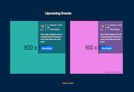
<h2 class="mb-3 text-white">Upcoming Events</h2>
<p>
Replenish man have thing gathering lights yielding shall you
</p>
</div>
</div>
</div>
<div class="row">
<div class="col-lg-6 col-md-6">
<div class="single_event position-relative">
<div class="event_thumb">
<img src="https://www.bootdey.com/image/500x500/20B2AA/000000" alt="" />
</div>
<div class="event_details">
<div class="d-flex mb-4">
<div class="date"><span>15</span> Jun</div>
<div class="time-location">
<p><span class="ti-time mr-2"></span> 12:00 AM - 12:30 AM</p>
<p><span class="ti-location-pin mr-2"></span> Hilton Quebec</p>
</div>
</div>
<p>
One make creepeth man for so bearing their firmament won't fowl meat over seas great
</p>
<a href="#" class="btn btn-primary rounded-0 mt-3">View Details</a>
</div>
</div>
</div>
<div class="col-lg-6 col-md-6">
<div class="single_event position-relative">
<div class="event_thumb">
<img src="https://www.bootdey.com/image/500x500/EE82EE/000000" alt="" />
</div>
<div class="event_details">
<div class="d-flex mb-4">
<div class="date"><span>15</span> Jun</div>
<div class="time-location">
<p><span class="ti-time mr-2"></span> 12:00 AM - 12:30 AM</p>
<p><span class="ti-location-pin mr-2"></span> Hilton Quebec</p>
</div>
</div>
<p>
One make creepeth man for so bearing their firmament won't fowl meat over seas great
</p>
<a href="#" class="btn btn-primary rounded-0 mt-3">View Details</a>
</div>
</div>
</div>
<div class="col-lg-12">
<div class="text-center pt-lg-5 pt-3">
<a href="#" class="event-link"> View All Event <img src="img/next.png" alt="" /> </a>
</div>
</div>
</div>
</div>
</div>
CSS code
Scoped CSS that styles the component. Paste it after Bootstrap 4.5.0 to keep the design, spacing, and responsiveness consistent.
Downloadbody{margin-top:20px;}
.events_area {
padding: 130px 0 100px;
background: #002347;
}
@media (max-width: 991px) {
.events_area {
padding: 70px 0;
}
}
.events_area .event-link {
color: #fdc632;
font-size: 13px;
text-transform: uppercase;
}
.events_area .event-link img {
margin-left: 5px;
display: inline-block;
}
.single_event {
margin-bottom: 30px;
}
.single_event .event_thumb {
overflow: hidden;
}
.single_event .event_thumb img {
-webkit-transition: all 0.3s ease 0s;
-moz-transition: all 0.3s ease 0s;
-o-transition: all 0.3s ease 0s;
transition: all 0.3s ease 0s;
}
.single_event .event_details {
background: rgba(0, 35, 71, 0.5);
position: absolute;
top: 0px;
right: 0px;
width: 275px;
padding: 30px 25px;
color: #ffffff;
}
.single_event .event_details .date {
color: #ffffff;
padding-right: 15px;
border-right: 2px solid #fff;
font-family: "Rubik", sans-serif;
font-size: 14px;
}
.single_event .event_details .date span {
display: block;
color: #fdc632;
font-size: 28px;
font-weight: 500;
}
.single_event .event_details .time-location {
padding-left: 15px;
font-size: 14px;
}
.single_event .event_details .time-location p {
margin-bottom: 0px;
}
.single_event .event_details .time-location p span {
color: #ffffff;
font-size: 13px;
font-weight: 500;
}
.single_event:hover img {
transform: scale(1.1);
}
.single_event:hover h4 a {
color: #fdc632;
}
FAQ
How do I use this snippet?
Include Bootstrap 4.5.0, paste the HTML, add the CSS block, and include the JS (if any) to mirror the live preview.
Can I use it in commercial projects?
Yes. It’s free for personal and commercial work; check the snippets license for details.
Is it responsive?
Yes. It inherits the responsive grid and components from Bootstrap 4.5.0.
About this bootstrap example/template
This free Bootstrap 4.5.0 snippet, upcoming events cards, was published on Sep 25th 2020, 08:50 by Bootdey Admin.
Optimized for copy‑paste: clean HTML, scoped CSS, and minimal JS so you can ship production‑ready UI faster and keep designs consistent.
Mobile‑first and responsive by default. Tested across modern browsers to reduce polish time on your project.
Already trusted in 10.5K+ views. Reuse this snippet to speed up landing pages, dashboards, or onboarding flows.
Bootstrap 4.5.0
<link rel='stylesheet' href='https://cdn.jsdelivr.net/npm/[email protected]/dist/css/bootstrap.min.css'>
<script src='https://cdn.jsdelivr.net/npm/[email protected]/dist/js/bootstrap.bundle.min.js'></script>
This code example is based on bootstrap 4.5.0 and the grid system of this framework
Responsive
Based on bootstrap framework makes all the layouts perfectly responsive for all devices
Crossbrowser compatibility
Tested on all major browsers, it works smoothly on all of them
semantic html 5
Built on html / css3 the code quality is really amazing
Simple Integration
This code example can be simply integrated on existing sites and new ones too, all you need to do is copy the code and start working
