HTML code
Clean, semantic HTML that powers this Bootstrap 3.3.4 snippet. Copy and paste it into your page (with Bootstrap loaded) to reproduce the exact layout shown in the preview.
Download<link href="https://maxcdn.bootstrapcdn.com/font-awesome/4.3.0/css/font-awesome.min.css" rel="stylesheet">
<div class="container bootstrap snippets bootdey">
<div class="col-md-8">
<div class="box box-widget">
<div class="box-header with-border">
<div class="user-block">
<img class="img-circle" src="https://bootdey.com/img/Content/avatar/avatar1.png" alt="User Image">
<span class="username"><a href="#">Jonathan Burke Jr.</a></span>
<span class="description">Shared publicly - 7:30 PM Today</span>
</div>
<div class="box-tools">
<button type="button" class="btn btn-box-tool" data-toggle="tooltip" title="" data-original-title="Mark as read">
<i class="fa fa-circle-o"></i></button>
<button type="button" class="btn btn-box-tool" data-widget="collapse"><i class="fa fa-minus"></i></button>
<button type="button" class="btn btn-box-tool" data-widget="remove"><i class="fa fa-times"></i></button>
</div>
</div>
<div class="box-body">
<p>Far far away, behind the word mountains, far from the
countries Vokalia and Consonantia, there live the blind
texts. Separated they live in Bookmarksgrove right at</p>
<p>the coast of the Semantics, a large language ocean.
A small river named Duden flows by their place and supplies
it with the necessary regelialia. It is a paradisematic
country, in which roasted parts of sentences fly into
your mouth.</p>
<div class="attachment-block clearfix">
<img class="attachment-img" src="https://www.bootdey.com/image/400x300/" alt="Attachment Image">
<div class="attachment-pushed">
<h4 class="attachment-heading"><a href="http://www.lipsum.com/">Lorem ipsum text generator</a></h4>
<div class="attachment-text">
Description about the attachment can be placed here.
Lorem Ipsum is simply dummy text of the printing and typesetting industry... <a href="#">more</a>
</div>
</div>
</div>
<button type="button" class="btn btn-default btn-xs"><i class="fa fa-share"></i> Share</button>
<button type="button" class="btn btn-default btn-xs"><i class="fa fa-thumbs-o-up"></i> Like</button>
<span class="pull-right text-muted">45 likes - 2 comments</span>
</div>
<div class="box-footer box-comments">
<div class="box-comment">
<img class="img-circle img-sm" src="https://bootdey.com/img/Content/avatar/avatar5.png" alt="User Image">
<div class="comment-text">
<span class="username">
Maria Gonzales
<span class="text-muted pull-right">8:03 PM Today</span>
</span>
It is a long established fact that a reader will be distracted
by the readable content of a page when looking at its layout.
</div>
</div>
<div class="box-comment">
<img class="img-circle img-sm" src="https://bootdey.com/img/Content/avatar/avatar6.png" alt="User Image">
<div class="comment-text">
<span class="username">
Nora Havisham
<span class="text-muted pull-right">8:03 PM Today</span>
</span>
The point of using Lorem Ipsum is that it has a more-or-less
normal distribution of letters, as opposed to using
'Content here, content here', making it look like readable English.
</div>
</div>
</div>
<div class="box-footer">
<form action="#" method="post">
<img class="img-responsive img-circle img-sm" src="https://bootdey.com/img/Content/avatar/avatar1.png" alt="Alt Text">
<div class="img-push">
<input type="text" class="form-control input-sm" placeholder="Press enter to post comment">
</div>
</form>
</div>
</div>
</div>
</div>CSS code
Scoped CSS that styles the component. Paste it after Bootstrap 3.3.4 to keep the design, spacing, and responsiveness consistent.
Downloadbody{
margin-top:20px;
background-color: #ecf0f5;
}
.box-widget {
border: none;
position: relative;
}
.box {
position: relative;
border-radius: 3px;
background: #ffffff;
border-top: 3px solid #d2d6de;
margin-bottom: 20px;
width: 100%;
box-shadow: 0 1px 1px rgba(0,0,0,0.1);
}
.box-header.with-border {
border-bottom: 1px solid #f4f4f4;
}
.box-header {
color: #444;
display: block;
padding: 10px;
position: relative;
}
.user-block img {
width: 40px;
height: 40px;
float: left;
}
.user-block .username {
font-size: 16px;
font-weight: 600;
}
.user-block .description {
color: #999;
font-size: 13px;
}
.user-block .username,
.user-block .description,
.user-block .comment {
display: block;
margin-left: 50px;
}
.box-header>.box-tools {
position: absolute;
right: 10px;
top: 5px;
}
.btn-box-tool {
padding: 5px;
font-size: 12px;
background: transparent;
color: #97a0b3;
}
.box-body {
border-top-left-radius: 0;
border-top-right-radius: 0;
border-bottom-right-radius: 3px;
border-bottom-left-radius: 3px;
padding: 10px;
}
.pad {
padding: 10px;
}
.box .btn-default {
background-color: #f4f4f4;
color: #444;
border-color: #ddd;
}
.box-comments {
background: #f7f7f7 !important;
}
.box-footer {
border-top-left-radius: 0;
border-top-right-radius: 0;
border-bottom-right-radius: 3px;
border-bottom-left-radius: 3px;
border-top: 1px solid #f4f4f4;
padding: 10px;
background-color: #fff;
}
.box-comments .box-comment:first-of-type {
padding-top: 0;
}
.box-comments .box-comment {
padding: 8px 0;
border-bottom: 1px solid #eee;
}
.img-sm,
.box-comments .box-comment img,
.user-block.user-block-sm img {
width: 30px !important;
height: 30px !important;
}
.img-sm, .img-md,
.img-lg, .box-comments .box-comment img,
.user-block.user-block-sm img {
float: left;
}
.box-comments .comment-text {
margin-left: 40px;
color: #555;
}
.box-comments .username {
color: #444;
display: block;
font-weight: 600;
}
.box-comments .text-muted {
font-weight: 400;
font-size: 12px;
}
.img-sm+.img-push {
margin-left: 40px;
}
.box .form-control {
border-radius: 0;
box-shadow: none;
border-color: #d2d6de;
}
.attachment-block {
border: 1px solid #f4f4f4;
padding: 5px;
margin-bottom: 10px;
background: #f7f7f7;
}
.attachment-block .attachment-img {
max-width: 100px;
max-height: 100px;
height: auto;
float: left;
}
.attachment-block .attachment-pushed {
margin-left: 110px;
}
.attachment-block .attachment-heading {
margin: 0;
}
.attachment-block .attachment-heading .h4, .attachment-block .attachment-heading h4 {
font-size: 18px;
}
.attachment-block .attachment-text {
color: #555;
}FAQ
How do I use this snippet?
Include Bootstrap 3.3.4, paste the HTML, add the CSS block, and include the JS (if any) to mirror the live preview.
Can I use it in commercial projects?
Yes. It’s free for personal and commercial work; check the snippets license for details.
Is it responsive?
Yes. It inherits the responsive grid and components from Bootstrap 3.3.4.
About this bootstrap example/template
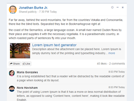
This free Bootstrap 3.3.4 snippet, social post link, was published on Nov 3rd 2015, 23:42 by Bootdey Admin.
Optimized for copy‑paste: clean HTML, scoped CSS, and minimal JS so you can ship production‑ready UI faster and keep designs consistent.
Mobile‑first and responsive by default. Tested across modern browsers to reduce polish time on your project.
Already trusted in 9.9K+ views. Reuse this snippet to speed up landing pages, dashboards, or onboarding flows.
Bootstrap 3.3.4
<link rel='stylesheet' href='https://netdna.bootstrapcdn.com/bootstrap/3.3.4/css/bootstrap.min.css'>
<script src='https://netdna.bootstrapcdn.com/bootstrap/3.3.4/js/bootstrap.min.js'></script>
This code example is based on bootstrap 3.3.4 and the grid system of this framework
Responsive
Based on bootstrap framework makes all the layouts perfectly responsive for all devices
Crossbrowser compatibility
Tested on all major browsers, it works smoothly on all of them
semantic html 5
Built on html / css3 the code quality is really amazing
Simple Integration
This code example can be simply integrated on existing sites and new ones too, all you need to do is copy the code and start working
