HTML code
Clean, semantic HTML that powers this Bootstrap 3.3.7 snippet. Copy and paste it into your page (with Bootstrap loaded) to reproduce the exact layout shown in the preview.
Download<link href="https://maxcdn.bootstrapcdn.com/font-awesome/4.3.0/css/font-awesome.min.css" rel="stylesheet">
<div class="container">
<div class="row">
<div class="col-md-8">
<div class="post-content">
<img src="https://www.bootdey.com/image/400x150/FFB6C1/000000" alt="post-image" class="img-responsive post-image">
<div class="post-container">
<img src="https://bootdey.com/img/Content/avatar/avatar6.png" alt="user" class="profile-photo-md pull-left">
<div class="post-detail">
<div class="user-info">
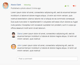
<h5><a href="timeline.html" class="profile-link">Alexis Clark</a> <span class="following">following</span></h5>
<p class="text-muted">Published a photo about 3 mins ago</p>
</div>
<div class="reaction">
<a class="btn text-green"><i class="fa fa-thumbs-up"></i> 13</a>
<a class="btn text-red"><i class="fa fa-thumbs-down"></i> 0</a>
</div>
<div class="line-divider"></div>
<div class="post-text">
<p>Lorem ipsum dolor sit amet, consectetur adipiscing elit, sed do eiusmod tempor incididunt ut labore et dolore magna aliqua. Ut enim ad minim veniam, quis nostrud exercitation ullamco laboris nisi ut aliquip ex ea commodo consequat. Duis aute irure dolor in reprehenderit in voluptate velit esse cillum dolore eu fugiat nulla pariatur. Excepteur sint occaecat cupidatat non proident, sunt in culpa qui officia deserunt mollit anim id est laborum. <i class="em em-anguished"></i> <i class="em em-anguished"></i> <i class="em em-anguished"></i></p>
</div>
<div class="line-divider"></div>
<div class="post-comment">
<img src="https://bootdey.com/img/Content/avatar/avatar7.png" alt="" class="profile-photo-sm">
<p><a href="timeline.html" class="profile-link">Diana </a><i class="em em-laughing"></i> Lorem ipsum dolor sit amet, consectetur adipiscing elit, sed do eiusmod tempor incididunt ut labore et dolore magna aliqua. Ut enim ad minim veniam, quis nostrud </p>
</div>
<div class="post-comment">
<img src="https://bootdey.com/img/Content/avatar/avatar1.png" alt="" class="profile-photo-sm">
<p><a href="timeline.html" class="profile-link">John</a> Lorem ipsum dolor sit amet, consectetur adipiscing elit, sed do eiusmod tempor incididunt ut labore et dolore magna aliqua. Ut enim ad minim veniam, quis nostrud </p>
</div>
<div class="post-comment">
<img src="https://bootdey.com/img/Content/avatar/avatar1.png" alt="" class="profile-photo-sm">
<input type="text" class="form-control" placeholder="Post a comment">
</div>
</div>
</div>
</div>
</div>
</div>
</div>CSS code
Scoped CSS that styles the component. Paste it after Bootstrap 3.3.7 to keep the design, spacing, and responsiveness consistent.
Downloadbody{margin-top:20px;}
/*==================================================
Post Contents CSS
==================================================*/
.post-content{
background: #f8f8f8;
border-radius: 4px;
width: 100%;
border: 1px solid #f1f2f2;
margin-bottom: 20px;
overflow: hidden;
position: relative;
}
.post-content img.post-image, video.post-video, .google-maps{
width: 100%;
height: auto;
}
.post-content .google-maps .map{
height: 300px;
}
.post-content .post-container{
padding: 20px;
}
.post-content .post-container .post-detail{
margin-left: 65px;
position: relative;
}
.post-content .post-container .post-detail .post-text{
line-height: 24px;
margin: 0;
}
.post-content .post-container .post-detail .reaction{
position: absolute;
right: 0;
top: 0;
}
.post-content .post-container .post-detail .post-comment{
display: inline-flex;
margin: 10px auto;
width: 100%;
}
.post-content .post-container .post-detail .post-comment img.profile-photo-sm{
margin-right: 10px;
}
.post-content .post-container .post-detail .post-comment .form-control{
height: 30px;
border: 1px solid #ccc;
box-shadow: inset 0 1px 1px rgba(0,0,0,.075);
margin: 7px 0;
min-width: 0;
}
img.profile-photo-md {
height: 50px;
width: 50px;
border-radius: 50%;
}
img.profile-photo-sm {
height: 40px;
width: 40px;
border-radius: 50%;
}
.text-green {
color: #8dc63f;
}
.text-red {
color: #ef4136;
}
.following {
color: #8dc63f;
font-size: 12px;
margin-left: 20px;
}
FAQ
How do I use this snippet?
Include Bootstrap 3.3.7, paste the HTML, add the CSS block, and include the JS (if any) to mirror the live preview.
Can I use it in commercial projects?
Yes. It’s free for personal and commercial work; check the snippets license for details.
Is it responsive?
Yes. It inherits the responsive grid and components from Bootstrap 3.3.7.
About this bootstrap example/template
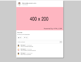
This free Bootstrap 3.3.7 snippet, simple social network post, was published on Dec 31st 2017, 17:26 by Bootdey Admin.
Optimized for copy‑paste: clean HTML, scoped CSS, and minimal JS so you can ship production‑ready UI faster and keep designs consistent.
Mobile‑first and responsive by default. Tested across modern browsers to reduce polish time on your project.
Already trusted in 17.0K+ views. Reuse this snippet to speed up landing pages, dashboards, or onboarding flows.
Bootstrap 3.3.7
<link rel='stylesheet' href='https://netdna.bootstrapcdn.com/bootstrap/3.3.7/css/bootstrap.min.css'>
<script src='https://netdna.bootstrapcdn.com/bootstrap/3.3.7/js/bootstrap.min.js'></script>
This code example is based on bootstrap 3.3.7 and the grid system of this framework
Responsive
Based on bootstrap framework makes all the layouts perfectly responsive for all devices
Crossbrowser compatibility
Tested on all major browsers, it works smoothly on all of them
semantic html 5
Built on html / css3 the code quality is really amazing
Simple Integration
This code example can be simply integrated on existing sites and new ones too, all you need to do is copy the code and start working
