HTML code
Clean, semantic HTML that powers this Bootstrap 5.1.3 snippet. Copy and paste it into your page (with Bootstrap loaded) to reproduce the exact layout shown in the preview.
Download<link href="https://maxcdn.bootstrapcdn.com/font-awesome/4.7.0/css/font-awesome.min.css" rel="stylesheet" />
<section id="about-section" class="pt-5 pb-5">
<div class="container wrapabout">
<div class="red"></div>
<div class="row">
<div class="col-lg-6 align-items-center justify-content-left d-flex mb-5 mb-lg-0">
<div class="blockabout">
<div class="blockabout-inner text-center text-sm-start">
<div class="title-big pb-3 mb-3">
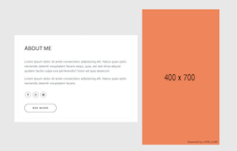
<h3>ABOUT ME</h3>
</div>
<p class="description-p text-muted pe-0 pe-lg-0">
Lorem ipsum dolor sit amet consectetur adipisicing elit. Natus quas optio reiciendis deleniti voluptatem facere sequi, quia, est sed dicta aliquid quidem facilis culpa iure perferendis? Dolor ad quia deserunt.
</p>
<p class="description-p text-muted pe-0 pe-lg-0">Lorem ipsum dolor sit amet consectetur adipisicing elit. Natus quas optio reiciendis deleniti voluptatem facere.</p>
<div class="sosmed-horizontal pt-3 pb-3">
<a href="#"><i class="fa fa-facebook"></i></a>
<a href="#"><i class="fa fa-instagram"></i></a>
<a href="#"><i class="fa fa-pinterest"></i></a>
</div>
<a href="#" class="btn rey-btn mt-3">See More</a>
</div>
</div>
</div>
<div class="col-lg-6 mt-5 mt-lg-0">
<figure class="potoaboutwrap">
<img src="https://bootdey.com/image/400x700/FF7F50/000000" alt="potoabout" />
</figure>
</div>
</div>
</div>
</section>
CSS code
Scoped CSS that styles the component. Paste it after Bootstrap 5.1.3 to keep the design, spacing, and responsiveness consistent.
Download#about-section {
background: rgba(32, 33, 36, 0.1);
position: relative;
}
.blockabout {
padding: 20px;
background: white;
}
.blockabout-inner {
padding: 30px;
border: 1px solid rgba(32, 33, 36, 0.1);
}
.sosmed-horizontal a i {
border: 1px solid #070707;
border-radius: 50%;
color: #070707;
display: inline-block;
height: 30px;
width: 30px;
line-height: 30px;
margin: auto 3px;
font-size: 15px;
text-align: center;
transition: all 0.3s;
}
.rey-btn {
border: 2px solid #070707;
padding: 10px 40px;
text-transform: uppercase;
letter-spacing: 2px;
font-size: 13px;
font-weight: 700;
border-radius: 50px;
transition: all 0.3s;
}
Javascript/Jquery code
Lightweight JS to power any interactions this snippet needs. Drop it under your scripts (after Bootstrap 5.1.3) to mirror the live demo.
Downloadvar testi = $('#testimonial-slide');
var owlcarouselslide = function(e) {
// testimonial slide
testi.owlCarousel({
autoplay: false,
center: true,
loop: true,
dots: true,
touchDrag: false,
mouseDrag: false,
smartSpeed: 900,
items: 1,
margin: 100,
nav: true,
navText: [
'<i class="fa fa-long-arrow-left " aria-hidden="true"></i>',
'<i class="fa fa-long-arrow-right " aria-hidden="true"></i>'
],
navContainer: '.custom-nav',
});
};
$(document).ready(function() {
owlcarouselslide();
}); FAQ
How do I use this snippet?
Include Bootstrap 5.1.3, paste the HTML, add the CSS block, and include the JS (if any) to mirror the live preview.
Can I use it in commercial projects?
Yes. It’s free for personal and commercial work; check the snippets license for details.
Is it responsive?
Yes. It inherits the responsive grid and components from Bootstrap 5.1.3.
About this bootstrap example/template
This free Bootstrap 5.1.3 snippet, simple about me section, was published on Mar 3rd 2022, 07:43 by Bootdey Admin.
Optimized for copy‑paste: clean HTML, scoped CSS, and minimal JS so you can ship production‑ready UI faster and keep designs consistent.
Mobile‑first and responsive by default. Tested across modern browsers to reduce polish time on your project.
Already trusted in 13.9K+ views. Reuse this snippet to speed up landing pages, dashboards, or onboarding flows.
Bootstrap 5.1.3
<link rel='stylesheet' href='https://cdn.jsdelivr.net/npm/[email protected]/dist/css/bootstrap.min.css'>
<script src='https://cdn.jsdelivr.net/npm/[email protected]/dist/js/bootstrap.bundle.min.js'></script>
This code example is based on bootstrap 5.1.3 and the grid system of this framework
Responsive
Based on bootstrap framework makes all the layouts perfectly responsive for all devices
Crossbrowser compatibility
Tested on all major browsers, it works smoothly on all of them
Jquery plugins
Great built-in plugins with jquery framework, you can easy to change all declarations
semantic html 5
Built on html / css3 the code quality is really amazing
Simple Integration
This code example can be simply integrated on existing sites and new ones too, all you need to do is copy the code and start working
