HTML code
Clean, semantic HTML that powers this Bootstrap 5.1.3 snippet. Copy and paste it into your page (with Bootstrap loaded) to reproduce the exact layout shown in the preview.
Download<div class="container-fluid">
<div class="container text-center">
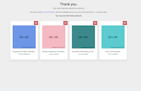
<h1>Thank you.</h1>
<p class="lead w-lg-50 mx-auto">Your order has been placed successfully.</p>
<p class="w-lg-50 mx-auto">Your order number is <a href="#">9237427634826</a>. We will immediatelly process your and it will be delivered in 2 - 5 business days.</p>
</div>
<div class="container">
<h2 class="h5 mb-5 text-center">You may also like these products</h2>
<div class="row">
<div class="col-lg-3">
<div class="card text-center mb-3">
<div class="py-5 px-4">
<img src="https://www.bootdey.com/image/280x280/6495ED/000000" alt="" class="img-fluid mb-4" />
<h3 class="fs-6 text-truncate"><a href="#" class="stretched-link text-reset">Smartphone 5G Black 12GB RAM+512GB NEW</a></h3>
<span class="text-success">$799.00</span> <del class="text-muted">$650.83</del>
</div>
<div class="bg-danger text-white small position-absolute end-0 top-0 px-2 py-2 lh-1 text-center">
<span class="d-block">10%</span>
<span class="d-block">OFF</span>
</div>
</div>
</div>
<div class="col-lg-3">
<div class="card text-center position-relative mb-3">
<div class="py-5 px-4">
<img src="https://www.bootdey.com/image/280x280/FFB6C1/000000" alt="" class="img-fluid mb-4" />
<h3 class="fs-6 text-truncate"><a href="#" class="stretched-link text-reset">Wireless Headphones with Noise Cancellation Tru Bass Bluetooth HiFi</a></h3>
<span class="text-success">$250.00</span> <del class="text-muted">$250</del>
</div>
<div class="bg-danger text-white small position-absolute end-0 top-0 px-2 py-2 lh-1 text-center">
<span class="d-block">25%</span>
<span class="d-block">OFF</span>
</div>
</div>
</div>
<div class="col-lg-3">
<div class="card text-center mb-3">
<div class="py-5 px-4">
<img src="https://www.bootdey.com/image/280x280/008B8B/000000" alt="" class="img-fluid mb-4" />
<h3 class="fs-6 text-truncate"><a href="#" class="stretched-link text-reset">Smartwatch IP68 Waterproof GPS and Bluetooth Support</a></h3>
<span class="text-success">$29.00</span> <del class="text-muted">$14.50</del>
</div>
<div class="bg-danger text-white small position-absolute end-0 top-0 px-2 py-2 lh-1 text-center">
<span class="d-block">50%</span>
<span class="d-block">OFF</span>
</div>
</div>
</div>
<div class="col-lg-3">
<div class="card text-center mb-3">
<div class="py-5 px-4">
<img src="https://www.bootdey.com/image/280x280/00CED1/000000" alt="" class="img-fluid mb-4" />
<h3 class="fs-6 text-truncate"><a href="#" class="stretched-link text-reset">Men's Running Shoes</a></h3>
<span class="text-success">$110.00</span> <del class="text-muted">$85.23</del>
</div>
<div class="bg-danger text-white small position-absolute end-0 top-0 px-2 py-2 lh-1 text-center">
<span class="d-block">25%</span>
<span class="d-block">OFF</span>
</div>
</div>
</div>
</div>
</div>
</div>
CSS code
Scoped CSS that styles the component. Paste it after Bootstrap 5.1.3 to keep the design, spacing, and responsiveness consistent.
Downloadbody {
margin-top: 20px;
}
.text-center {
text-align: center !important;
}
.mb-5 {
margin-bottom: 3rem !important;
}
.mx-auto {
margin-right: auto !important;
margin-left: auto !important;
}
.text-reset {
--bs-text-opacity: 1;
color: inherit !important;
}
a {
color: #5465ff;
text-decoration: none;
}
body {
background: #eee;
}
.card {
box-shadow: 0 20px 27px 0 rgb(0 0 0 / 5%);
}
.card {
position: relative;
display: flex;
flex-direction: column;
min-width: 0;
word-wrap: break-word;
background-color: #fff;
background-clip: border-box;
border: 0 solid rgba(0, 0, 0, 0.125);
border-radius: 1rem;
}
.card-body {
-webkit-box-flex: 1;
-ms-flex: 1 1 auto;
flex: 1 1 auto;
padding: 1.5rem 1.5rem;
}
FAQ
How do I use this snippet?
Include Bootstrap 5.1.3, paste the HTML, add the CSS block, and include the JS (if any) to mirror the live preview.
Can I use it in commercial projects?
Yes. It’s free for personal and commercial work; check the snippets license for details.
Is it responsive?
Yes. It inherits the responsive grid and components from Bootstrap 5.1.3.
About this bootstrap example/template
This free Bootstrap 5.1.3 snippet, order placed successfully, was published on Jan 31st 2022, 08:54 by Bootdey Admin.
Optimized for copy‑paste: clean HTML, scoped CSS, and minimal JS so you can ship production‑ready UI faster and keep designs consistent.
Mobile‑first and responsive by default. Tested across modern browsers to reduce polish time on your project.
Already trusted in 12.1K+ views. Reuse this snippet to speed up landing pages, dashboards, or onboarding flows.
Bootstrap 5.1.3
<link rel='stylesheet' href='https://cdn.jsdelivr.net/npm/[email protected]/dist/css/bootstrap.min.css'>
<script src='https://cdn.jsdelivr.net/npm/[email protected]/dist/js/bootstrap.bundle.min.js'></script>
This code example is based on bootstrap 5.1.3 and the grid system of this framework
Responsive
Based on bootstrap framework makes all the layouts perfectly responsive for all devices
Crossbrowser compatibility
Tested on all major browsers, it works smoothly on all of them
semantic html 5
Built on html / css3 the code quality is really amazing
Simple Integration
This code example can be simply integrated on existing sites and new ones too, all you need to do is copy the code and start working
