HTML code
Clean, semantic HTML that powers this Bootstrap 3.2.0 snippet. Copy and paste it into your page (with Bootstrap loaded) to reproduce the exact layout shown in the preview.
Download<link rel="stylesheet" type="text/css" href="//netdna.bootstrapcdn.com/font-awesome/4.1.0/css/font-awesome.min.css">
<div class="container bootstrap snippets bootdey">
<hr>
<ol class="breadcrumb">
<li><a href="#">Page name</a></li>
<li><a href="#">Search Results</a></li>
<li class="pull-right"><a href="" class="text-muted"><i class="fa fa-refresh"></i></a></li>
</ol>
<div class="row">
<div class="col-xs-12 col-sm-12 col-md-12 col-lg-12">
<div class="well search-result">
<div class="input-group">
<input type="text" class="form-control" placeholder="Search">
<span class="input-group-btn">
<button class="btn btn-info btn-lg" type="button">
<i class="glyphicon glyphicon-search"></i>
Search
</button>
</span>
</div>
</div>
<div class="well search-result">
<div class="row">
<a href="#">
<div class="col-xs-6 col-sm-3 col-md-3 col-lg-2">
<img class="img-responsive" src="https://www.bootdey.com/image/400x200/7B68EE/000000" alt="">
</div>
<div class="col-xs-6 col-sm-9 col-md-9 col-lg-10 title">
<h3>Result name one</h3>
<p>Ut quis libero id orci semper porta ac vel ante. In nec laoreet sapien. Nunc hendrerit ligula at massa sodales, ullamcorper rutrum orci semper.</p>
</div>
</a>
</div>
</div>
<div class="well search-result">
<div class="row">
<a href="#">
<div class="col-xs-6 col-sm-3 col-md-3 col-lg-2">
<img class="img-responsive" src="https://www.bootdey.com/image/400x200/FA8072/000000" alt="">
</div>
<div class="col-xs-6 col-sm-9 col-md-9 col-lg-10 title">
<h3>Blueberry Sport</h3>
<p>Nulla rhoncus lacus tortor, vel tincidunt dolor eleifend et. Ut consequat elit quam, iaculis volutpat ipsum fermentum pulvinar. Pellentesque nec sem vel arcu ornare faucibus.</p>
</div>
</a>
</div>
</div>
<div class="well search-result">
<div class="row">
<a href="#">
<div class="col-xs-6 col-sm-3 col-md-3 col-lg-2">
<img class="img-responsive" src="https://www.bootdey.com/image/400x200/48D1CC/000000" alt="">
</div>
<div class="col-xs-6 col-sm-9 col-md-9 col-lg-10 title">
<h3>Power Thirst</h3>
<p>Cras nisi dolor, tristique id vehicula vitae, mollis at eros. Ut euismod sem eu tellus vestibulum, in facilisis est feugiat. Mauris sed leo sed erat vestibulum suscipit.</p>
</div>
</a>
</div>
</div>
<div class="row">
<button type="button" class="btn btn-info btn-block">
<i class="glyphicon glyphicon-refresh"></i>Load more...
</button>
</div>
</div>
</div>
</div>CSS code
Scoped CSS that styles the component. Paste it after Bootstrap 3.2.0 to keep the design, spacing, and responsiveness consistent.
Downloadbody{
background:#eee;
}
.search-result .title h3 {
margin: 0 0 15px;
color: #333;
}
.search-result .title p {
font-size: 12px;
color: #333;
}
.well {
border: 0;
padding: 20px;
min-height: 63px;
background: #fff;
box-shadow: none;
border-radius: 3px;
position: relative;
max-height: 100000px;
border-bottom: 2px solid #ccc;
transition: max-height 0.5s ease;
-o-transition: max-height 0.5s ease;
-ms-transition: max-height 0.5s ease;
-moz-transition: max-height 0.5s ease;
-webkit-transition: max-height 0.5s ease;
}
.form-control {
height: 45px;
padding: 10px;
font-size: 16px;
box-shadow: none;
border-radius: 0;
position: relative;
} FAQ
How do I use this snippet?
Include Bootstrap 3.2.0, paste the HTML, add the CSS block, and include the JS (if any) to mirror the live preview.
Can I use it in commercial projects?
Yes. It’s free for personal and commercial work; check the snippets license for details.
Is it responsive?
Yes. It inherits the responsive grid and components from Bootstrap 3.2.0.
About this bootstrap example/template
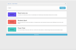
This free Bootstrap 3.2.0 snippet, Search Results with image, was published on Jul 31st 2014, 18:24 by Bootdey Admin.
Optimized for copy‑paste: clean HTML, scoped CSS, and minimal JS so you can ship production‑ready UI faster and keep designs consistent.
Mobile‑first and responsive by default. Tested across modern browsers to reduce polish time on your project.
Already trusted in 20.7K+ views. Reuse this snippet to speed up landing pages, dashboards, or onboarding flows.
Bootstrap 3.2.0
<link rel='stylesheet' href='https://netdna.bootstrapcdn.com/bootstrap/3.2.0/css/bootstrap.min.css'>
<script src='https://netdna.bootstrapcdn.com/bootstrap/3.2.0/js/bootstrap.min.js'></script>
This code example is based on bootstrap 3.2.0 and the grid system of this framework
Responsive
Based on bootstrap framework makes all the layouts perfectly responsive for all devices
Crossbrowser compatibility
Tested on all major browsers, it works smoothly on all of them
semantic html 5
Built on html / css3 the code quality is really amazing
Simple Integration
This code example can be simply integrated on existing sites and new ones too, all you need to do is copy the code and start working
