HTML code
Clean, semantic HTML that powers this Bootstrap 3.3.4 snippet. Copy and paste it into your page (with Bootstrap loaded) to reproduce the exact layout shown in the preview.
Download<div class="container bootstrap snippets bootdey">
<div class="row">
<div class="col-sm-6 push-bit">
<a href="#" class="gallery-link"><img src="https://www.bootdey.com/image/700x250/FF4500/000000" alt="" class="img-responsive push-bit" /></a>
<div class="row push-bit">
<div class="col-xs-4">
<a href="#" class="gallery-link"><img src="https://www.bootdey.com/image/400x200/DA70D6/000000" alt="" class="img-responsive" /></a>
</div>
<div class="col-xs-4">
<a href="#" class="gallery-link"><img src="https://www.bootdey.com/image/400x200/4169E1/000000" alt="" class="img-responsive" /></a>
</div>
<div class="col-xs-4">
<a href="#" class="gallery-link"><img src="https://www.bootdey.com/image/400x200/40E0D0/000000" alt="" class="img-responsive" /></a>
</div>
</div>
</div>
<div class="col-sm-6 push-bit">
<div class="clearfix">
<div class="pull-right">
<span class="h2"><strong>$ 69</strong></span>
</div>
<span class="h4">
<strong class="text-success">Table super power n2000</strong><br />
<small>15 Available</small>
</span>
</div>
<hr />
<p>
Sed porttitor pretium venenatis. Suspendisse potenti. Aliquam quis ligula elit. Aliquam at orci ac neque semper dictum. Sed tincidunt scelerisque ligula, et facilisis nulla hendrerit non. Suspendisse potenti. Pellentesque
non accumsan orci.
</p>
<p>
Sed porttitor pretium venenatis. Suspendisse potenti. Aliquam quis ligula elit. Aliquam at orci ac neque semper dictum. Sed tincidunt scelerisque ligula, et facilisis nulla hendrerit non. Suspendisse potenti. Pellentesque
non accumsan orci.
</p>
<hr />
<form action="" method="post" class="form-inline push-bit text-right">
<select id="ecom-addcart-size" name="ecom-addcart-size" class="form-control" size="1">
<option value="0" disabled="" selected="">SIZE</option>
<option value="xs">XS</option>
<option value="s">S</option>
<option value="m">M</option>
<option value="l">L</option>
<option value="xl">XL</option>
<option value="xxl">XXL</option>
</select>
<button type="submit" class="btn btn-info">Add to Cart</button>
</form>
</div>
</div>
</div>
CSS code
Scoped CSS that styles the component. Paste it after Bootstrap 3.3.4 to keep the design, spacing, and responsiveness consistent.
Downloadbody{
margin-top:20px;
}
.push-bit {
margin-bottom: 30px;
}FAQ
How do I use this snippet?
Include Bootstrap 3.3.4, paste the HTML, add the CSS block, and include the JS (if any) to mirror the live preview.
Can I use it in commercial projects?
Yes. It’s free for personal and commercial work; check the snippets license for details.
Is it responsive?
Yes. It inherits the responsive grid and components from Bootstrap 3.3.4.
About this bootstrap example/template
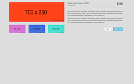
This free Bootstrap 3.3.4 snippet, Product view, was published on Jul 26th 2015, 22:15 by Bootdey Admin.
Optimized for copy‑paste: clean HTML, scoped CSS, and minimal JS so you can ship production‑ready UI faster and keep designs consistent.
Mobile‑first and responsive by default. Tested across modern browsers to reduce polish time on your project.
Already trusted in 10.4K+ views. Reuse this snippet to speed up landing pages, dashboards, or onboarding flows.
Bootstrap 3.3.4
<link rel='stylesheet' href='https://netdna.bootstrapcdn.com/bootstrap/3.3.4/css/bootstrap.min.css'>
<script src='https://netdna.bootstrapcdn.com/bootstrap/3.3.4/js/bootstrap.min.js'></script>
This code example is based on bootstrap 3.3.4 and the grid system of this framework
Responsive
Based on bootstrap framework makes all the layouts perfectly responsive for all devices
Crossbrowser compatibility
Tested on all major browsers, it works smoothly on all of them
semantic html 5
Built on html / css3 the code quality is really amazing
Simple Integration
This code example can be simply integrated on existing sites and new ones too, all you need to do is copy the code and start working
